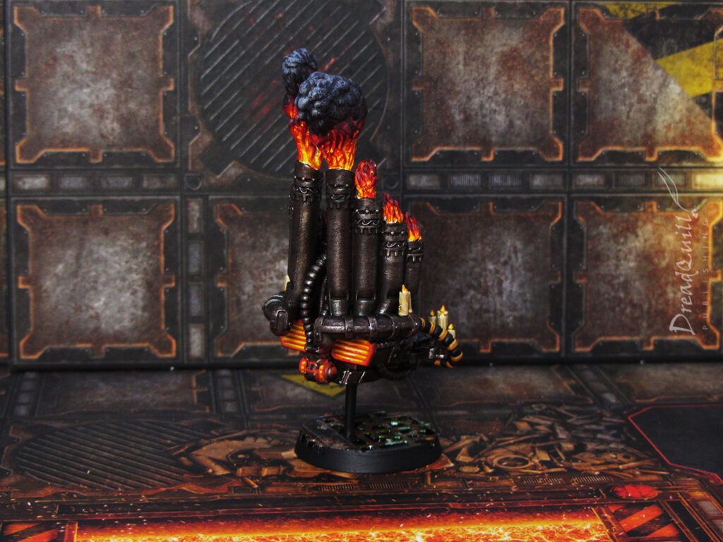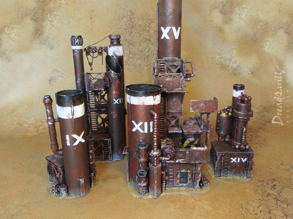
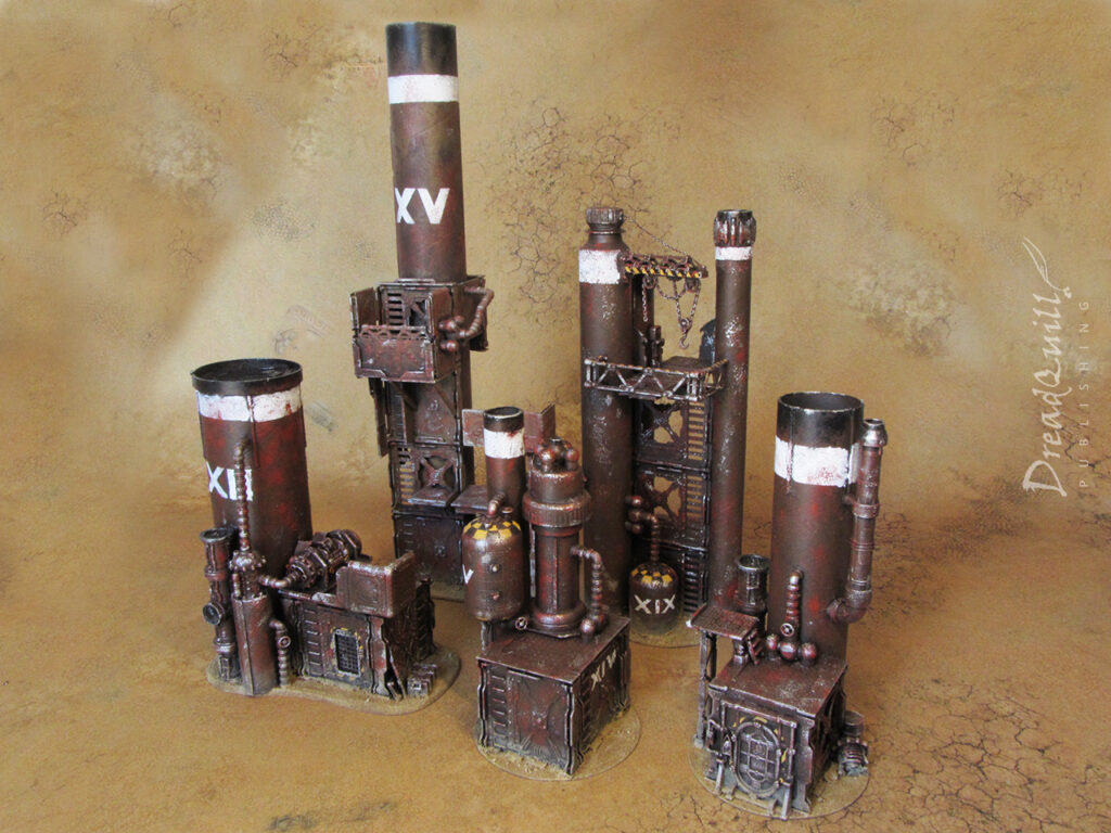
MOTB: Ash waste chimney stacks for Necromunda

Finished product first!

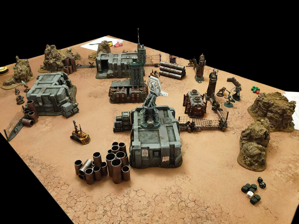
Oops it’s been two full years since Necromunda Ash Wastes was released and I have yet to play a single Ash Wastes game. I have, however, played dozens of games on ashen, wasted environments thanks to a bunch of terrain I created over lockdown.

I ran a successful Outlanders Necromunda campaign last year “Moon of the Mad Magos” which featured a variety of overground badlands maps, and an Inquisitor campaign “Crown of Bones” where these chimney stacks helped populate the sparser boards.

The brief

I didn’t set out to build a bunch of chimney stacks from scratch, it was an organic series of decisions as part of my pandemic project to standardise my scenery collection into ‘sets’.

I already had two of the five “stacks” built – these had been ancient pieces of terrain I’d been lugging around with me across five student houses since my days of playing Inquisitor in the family shed as a teenager. They were looking a little tired and out of place – drybrushed grey was very 2008 Cityfight, but not so much fun to look at these days.

I also had two other miscellaneous ruins, also using CDs for bases, using old N95 Necromunda bulkheads as the basis for their construction. They had served me well over the years, but I never used them any more as they were always out of line with my other scenery pieces. It was time to return them to the primordial goo and see what emerged.
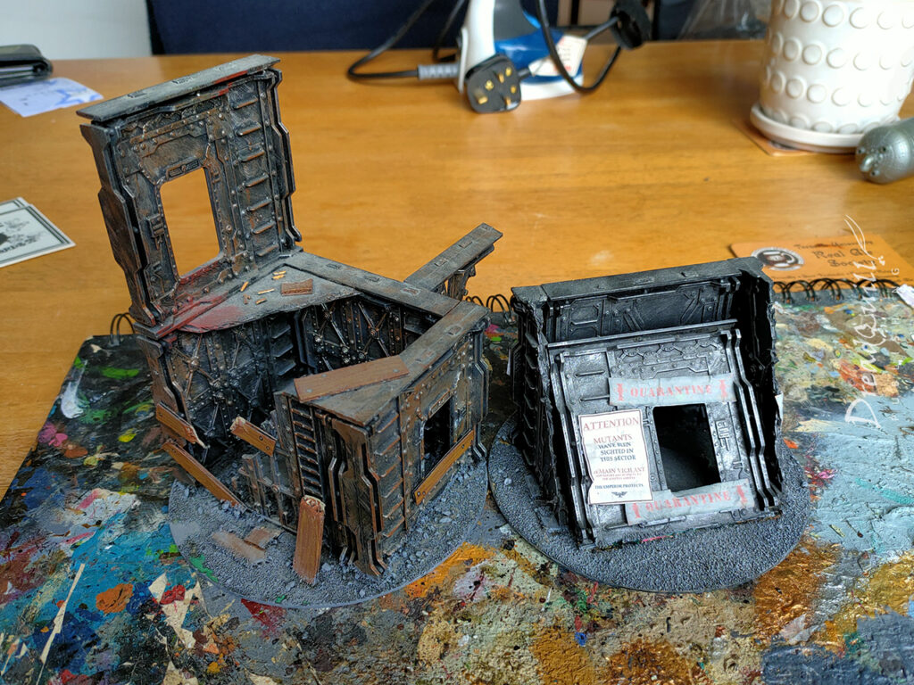
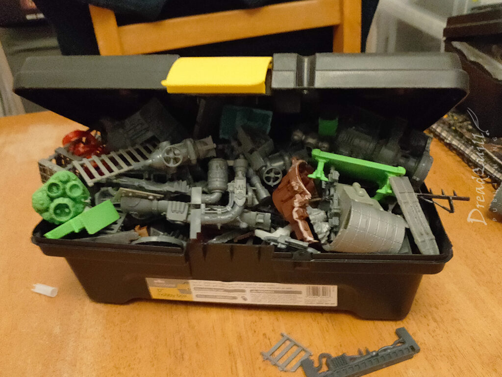
As I was sifting through my bits box, I realised I had quite a few spare bulkheads and other large industrial pieces lying around. Not enough to make a whole board out of, but enough to create a few pieces of interest.

My recyling bin during lockdown was overflowing with different sized tubes, so why not make some weird tubular structures? After all, Ash Wastes was just round the corner, and surely I’d be playing a lot of that when it came out.

Waste not

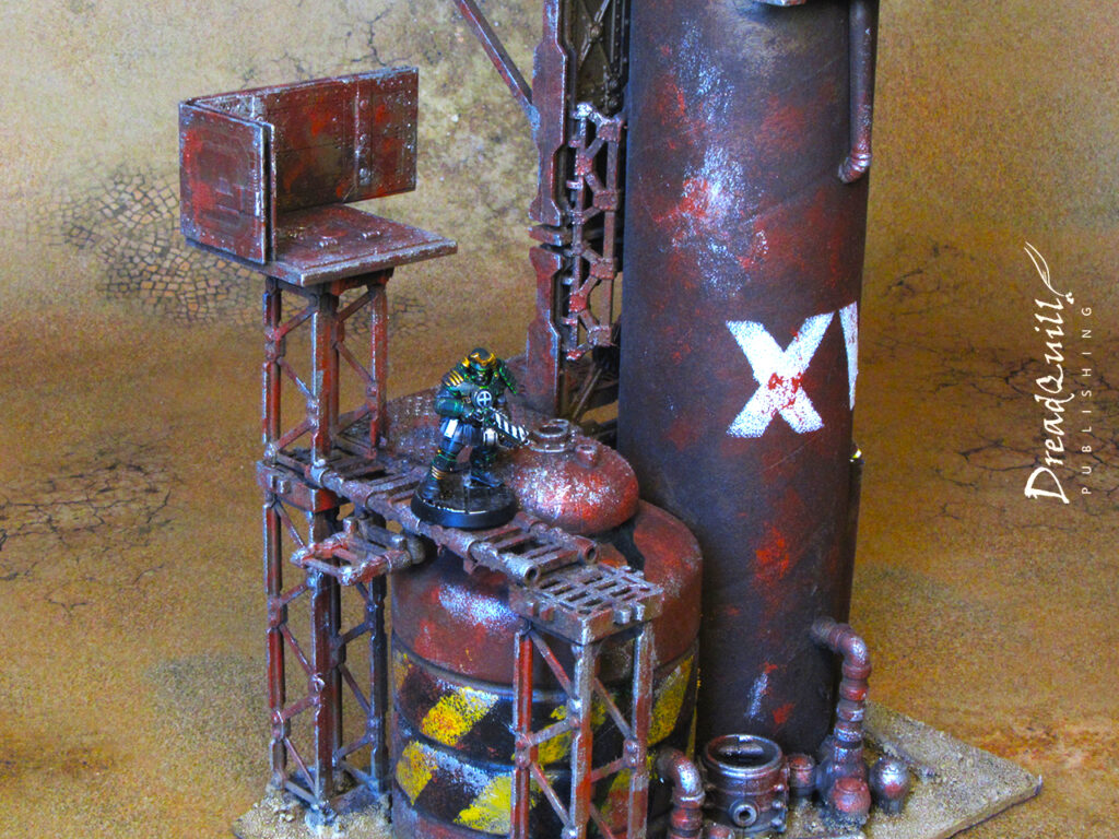
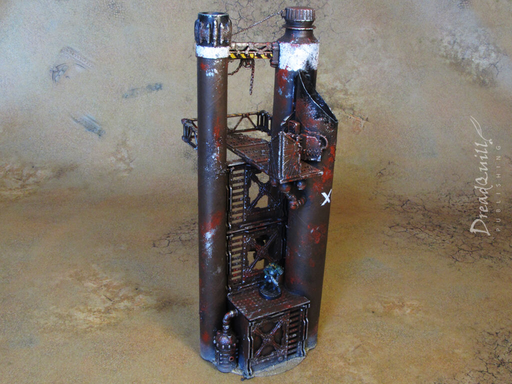
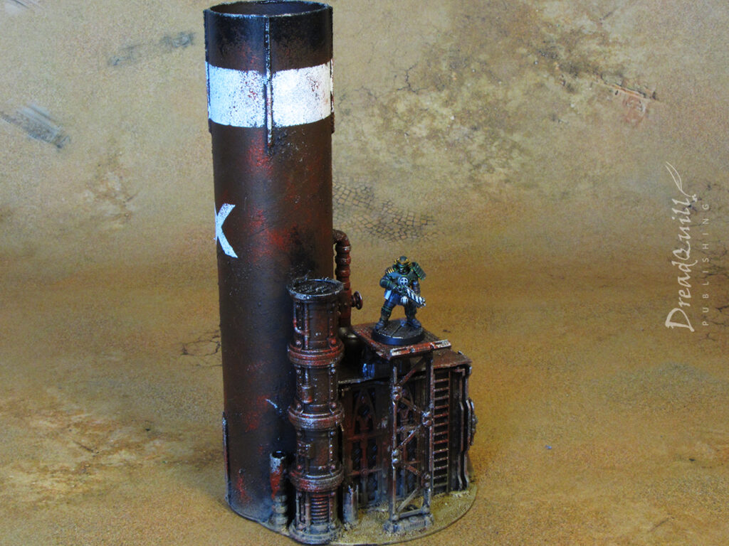
With the two tallest stacks already built, (and the XV stack was already painted) I didn’t do anything to them beyond adding a few extra details. The three new buildings had to have a cohesive look that would match each other as well as the existing two stacks.

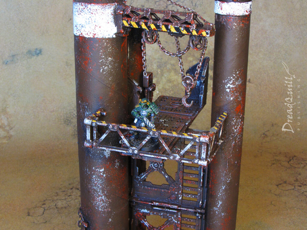
I opted for a ‘small hut attached to large tube’ design for all three, varying the size of the hut and the tube. In my hobby longbeard years I’ve become a huge fan of generic, solid pieces of terrain over more detailed specific pieces. These solid pieces would primarily function as risers to attach walkways to, so having plenty of play space on their roofs was important.
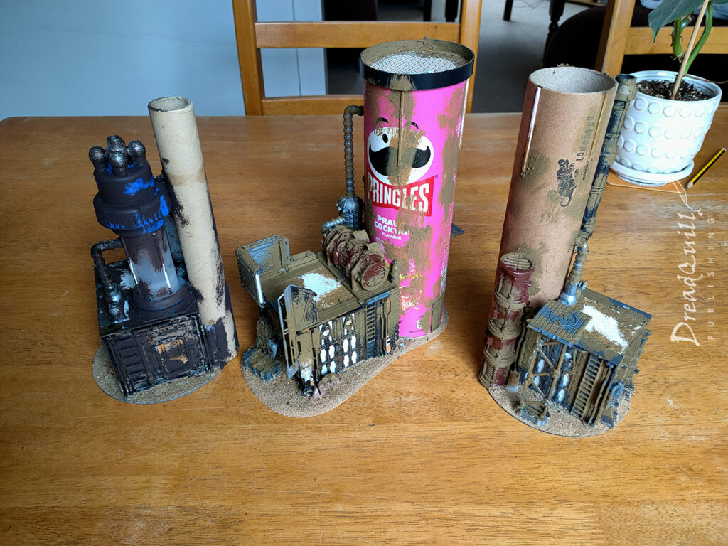
Turning the Necromunda bulkheads into solid buildings was a bit of a faff. Most of them have cut-out windows or seethrough ladders, and there are always gaps in the corners when you bump them up against each other.

I had to shave down the inside walls of the bulkheads to make a piece of plasticard sit flush against the ‘window’ sections, and used small bits of cardboard to wedge in between the corners to make a snug fit. A bit chewy to sort out, but the end result is worth it.

I have a few spare bulkheads, and I think I’ll make a few of these ‘building block’ bulkheads and cast them up in resin so I can make more of these kinds of thing without spending crazy money on more OOP plastic bulkheads.
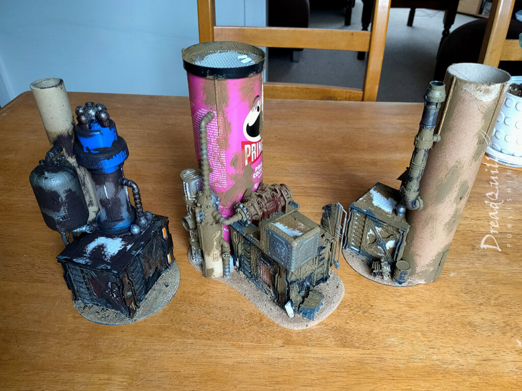
Once the huts were roughly attached to their tubes, I started detailing them with all manner of odds and ends from the bits box. A few bits of plastic crap from the recyling bin were added to lengths of industrial pipe from various editions of GW plastic pipe, with some smaller details added on the bases that can double up as cover for miniatures on the ground level.

Once everything was solid, I gave it a liberal application of my patent-pending textured paint mix: equal parts PVA glue, ready-mixed filler, and dark coloured poster paint (add basing mix as desired). The filler adds very fine grain to the mix and helps fill any unsightly gaps. Filler’s one big weakness as a hobby product is that it’s naturally very brittle and crumbly, so the PVA counteracts this by binding to and hardening the filler. The dark paint means you can slop it around in the dark recesses and not worry about white filler peeking through your undercoat.

stacking them up

Painting these pieces was an absolute delight. I had already developed a colour scheme with the tallest XV stack, I just had to recreate the browns I had used since the place I bought the paints from had now sadly gone bust (RIP Wilko).
Firstly, everything gets hit with a healthy coat or two of matt black rattle can. My go-to is Autotek cheap car primer, which you can get for around £6 a can if you buy online in packs of 4 or more. Absolutely worth it when you’re doing scenery – you don’t want to scrimp on your undercoat.

If you’re running low on other colours you can usually stretch them further without sacrificing the overall look of the piece, but if you run out of undercoat you’re buggered from the start.
Everything then got a liberal sponging of dark brown. You’re not looking for a solid covering, just enough to give everything an uneven, patchy appearance, and to leave some black in the deepest recesses of the model
Once the base brown was on, it was time to stentil on the details. Every step after this would be weathering, and those are always best applied over the top of block colours, so I had to crack out the masking tape.

I wanted something simple and eye catching, reminiscent of the original battle reports from early ’00s White Dwarf. Big blocks of colour with random numeral markings give generic industrial vibes, and having similar markings across each terrain piece would help tie them visually together.

I masked out the areas I wanted to be white, hand cutting some stencils for the roman numerals. I mostly picked roman numerals because they’re all straight lines and I didn’t have to cut out any round characters. The white was sponged over the top.

Hazard stripes were hand painted, not overly concerning myself with being too neat as they were going to get weathered to high heaven anyway.
Once the block colours were on, it was time for the weathering. For all my larger ash waste pieces I went for big bold colours without worrying about any of the details. Although their designs are very detailed, I didn’t want them to detract from any of the models or centrepieces on the board, so they needed to blend into the background.

With that in mind, all the weathering was done with a torn up bit of sponge so I could cover lots of ground and not get lost in the detail.
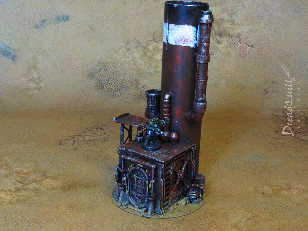
The first round of weathering was with a lighter, more reddish orange to suggest rusted patches on the metal work.

The second round of weathering was a silvery metal, concentrated on edges, corners, or anywhere that might see heavy traffic from vehicles, hands, or feet.
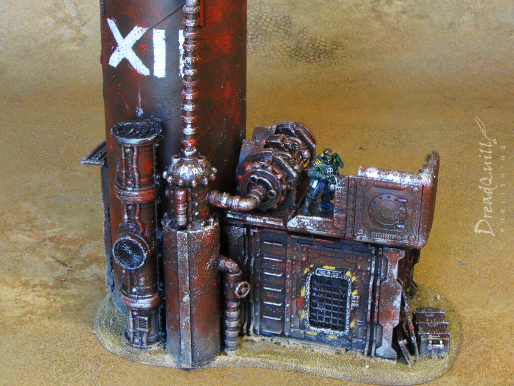
The final step was to paint the base to match the battle mat I owned. It took a bit of trial and error to come up with something that was close enough while being easy to replicate, and your version will look something quite different.

  1. Fully cover with Zandri Dust, followed by a Ushabti Bone drybrush
  2. Give it a light wash with Seraphim Sepia
  3. Apply a final light drybrush of Ushabti Bone to the most prominent raised areas
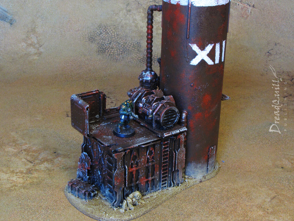
The final step was to blend the model into the base by giving it a dusty coating around the bottom. This sells the idea of the ground being covered in very fine, clingy dust, and (more importantly) covers up any mistakes I made while drybrushing the base.
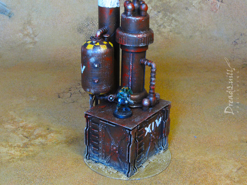
And they were finished!

I’m over the moon with how they came out. Many projects I work on have lulls in interest for me, as certain sections I can find difficult or tedious to complete, but not on this project. Every stage was a joy to complete – from stripping down old unused terrain, to assembling new buildings from odds and ends, to painting them quickly and effectively with a big bit of sponge. The end result speaks for itself!

I’ll be replicating the painting technique across the ash wastes box set I have, and combine it with some hills I have planned. Watch this space…
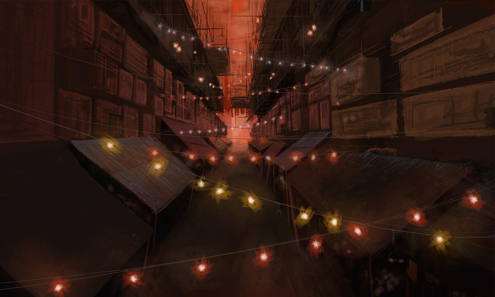
MOTB: Inquisitor-scale laboratory equipment

mad science lab furniture
inquisitor 54mm mad science laboratory equipment 01
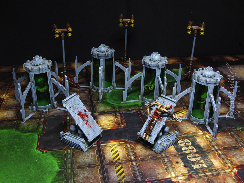
Finished product first!

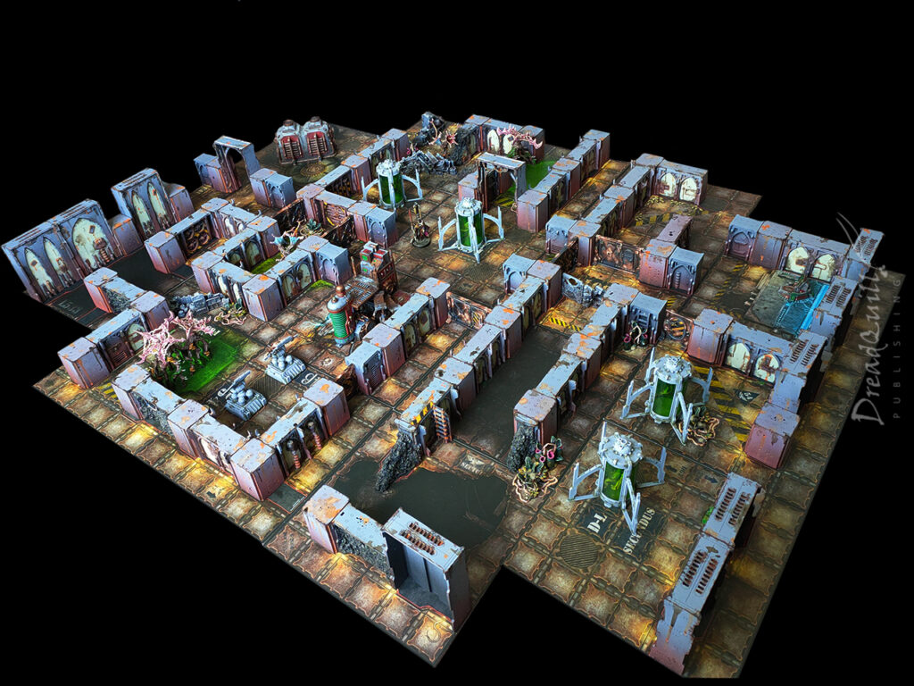
A scenario in an old Inquisitor campaign, Crown of Bones, called for the infiltration of a secret genetics lab deep beneath a Navis Nobilite estate. I planned to use my Necromunda walls and tiles to create the winding catacombs, but I didn’t have anything I could use as set dressing. Just what is in a horrible genetics lab?

I hit the internet and scrolled through the usual scenery vendor fares, but nobody offered anything like what I was looking for. You might find the odd cryo chamber or tesla coil on some independent retailers but I needed enough props to fill a table, not just one or two small pieces barely enough for cover. It was time to hit the bits box.

I was working in the lab late one night

The most consistent problem I butted up against was what to actually build. We’ve all got a pretty strong mental picture of a mad science lab, but trying to pick out individual components to enlarge and duplicate was surprisingly tough. I had a limited amount of time before the game I’d need them for, so I couldn’t do anything overly complicated either.

I needed floor-fillers that were visual shorthand for ‘bad things happen here’, and that could be reasonably re-used in other games or settings without any effort. I wanted to do the classics like rows of bubbling beakers, tesla coils, or cogitator stacks, but nowhere sold anything large or detailed enough to use as a conversion base I didn’t have the time, money, or inclination to scratch build my own. I boiled it down to three key features:

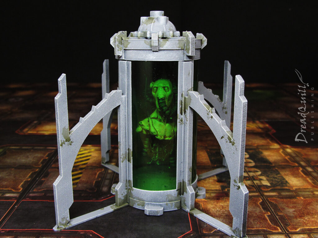
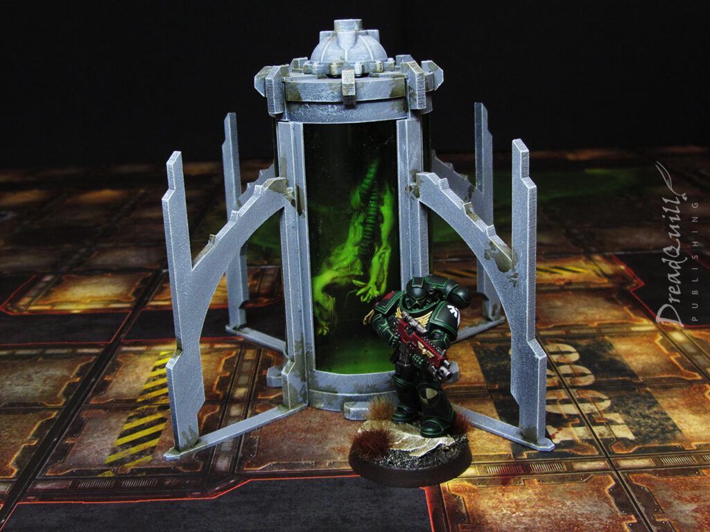
  • Cloning vats – it was a genetics lab filled with failed clones, so this was a must.
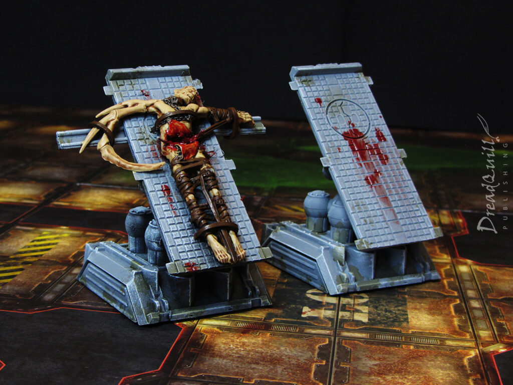
  • Surgery/autopsy tables – a sci fi horror staple, and can easily be repurposed into a dozen other Inquisitor scenarios.
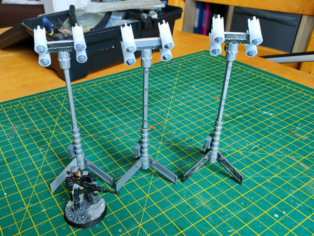
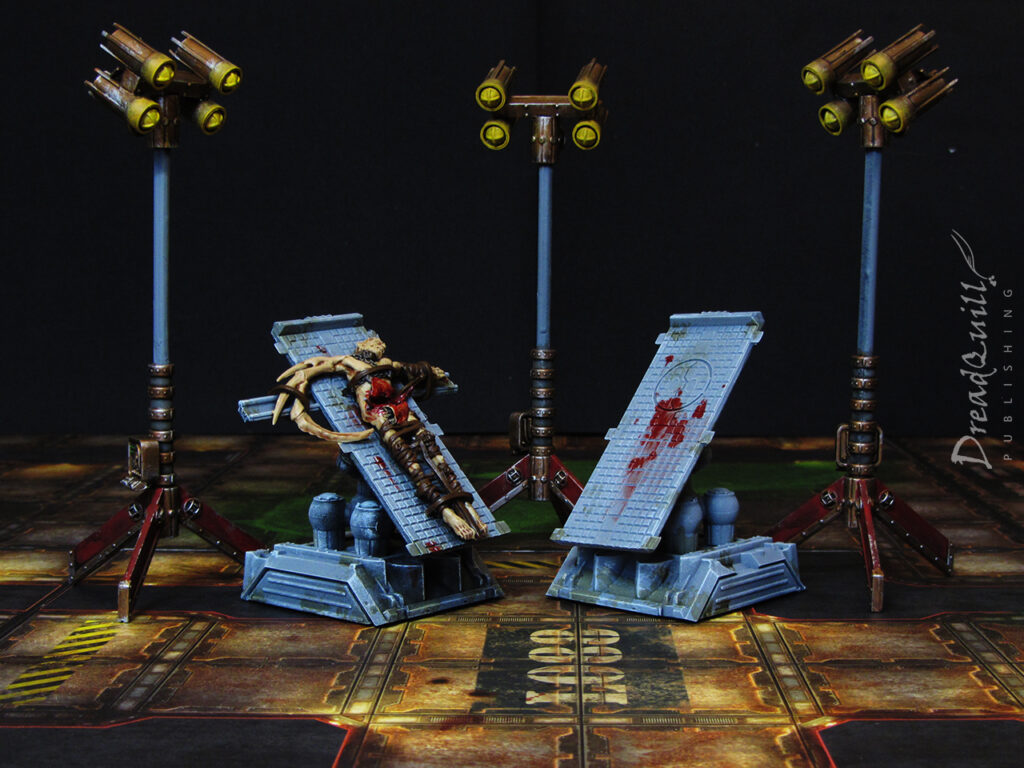
  • Floodlights – I originally planned for multi-limbed auto-surgeons with lamps on them, but settled on floodlights for their versatility. They could be used in any number of outdoor situations, and provide an extra dynamic to the board. Not only can you play with lighting condition modifiers, but you can strategically place them around your plot maguffin to signpost to your players what they should be looking at. A literal metaphorical spotlight!
Cloning vats

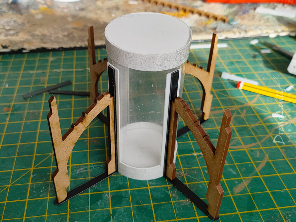
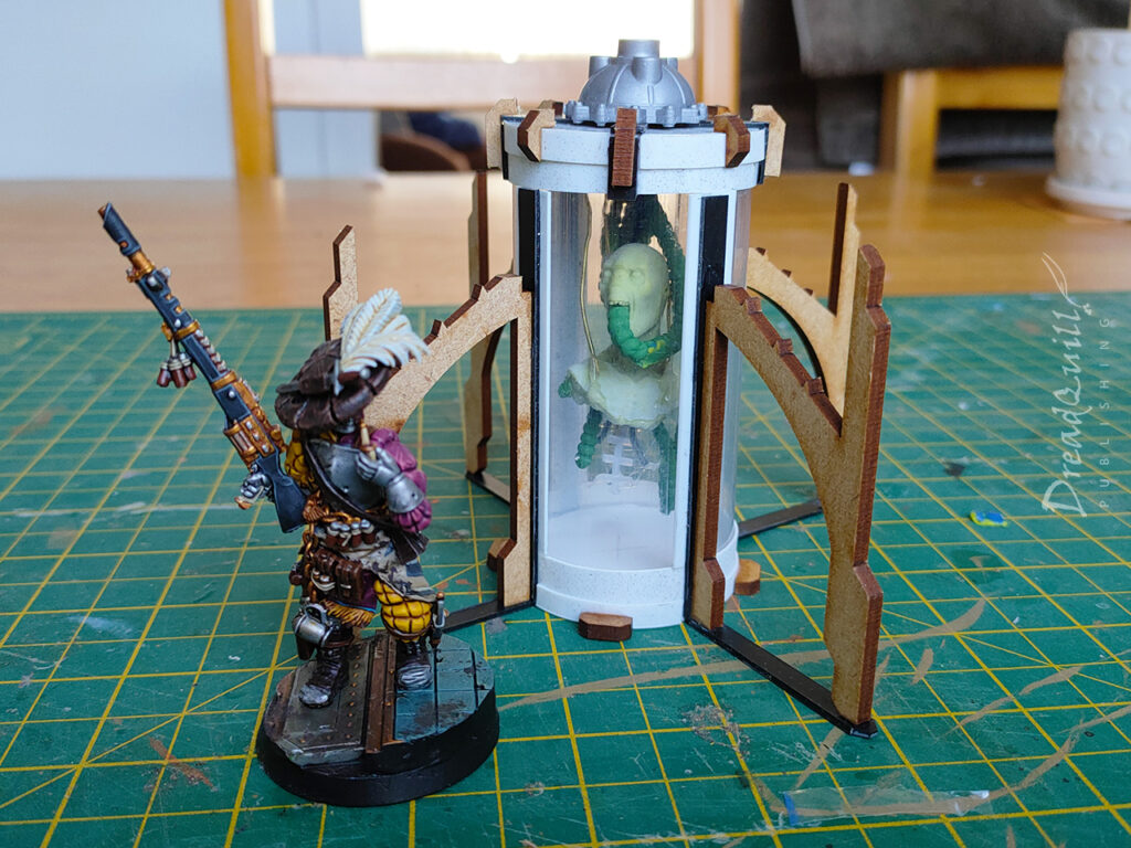
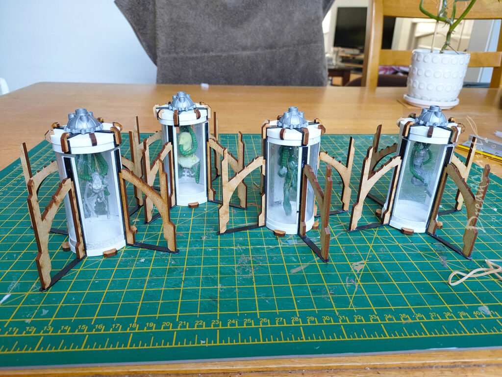
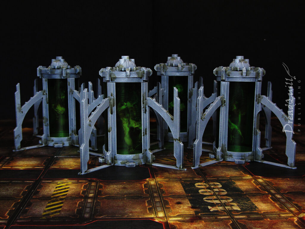
These were the bits I needed to get right, so they took most of my energy. I already had a rough idea of how I wanted it to look – I had a lot of MDF gothic buttresses lying around from my hab block project that would be perfect around a central pillar, but what to use for the vat itself?

inquisitor 54mm mad science laboratory wip 06

I played with the idea of doing the vat in clear resin and illuminating it with an LED, but that involved more experimentation time than I had available to me. I eventually found some clear plastic tube packaging that came with some washi tape, so snatched up a couple packs of that and set to work carving them into more appropriate sizes.

The casing was made from strips of plasticard cut to length, with circles of foamboard at the top and bottom for structural integrity. I detailed it with little plastic and mdf gubbins to give it more interesting shapes when it came to painting.

inquisitor 54mm mad science laboratory equipment wip 09

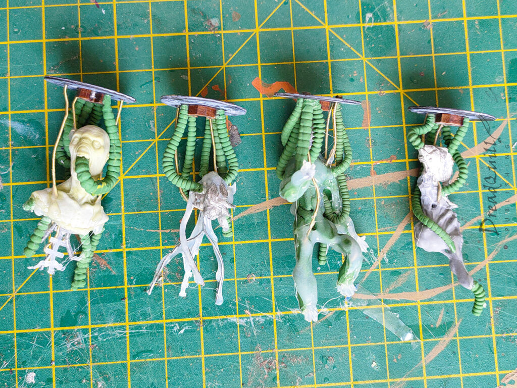
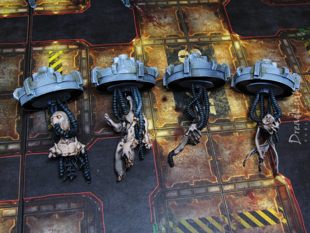
I wanted the interiors to be removable so I had a choice of inhabitant for future usage. I made up a few horrible little guys out of random odds and ends from the bits box, some wire, green stuff tentacles, and hot glue (inspired by the suitably horrible Widower project). They didn’t need to be anything specific, just representative of something organic and questionably alive floating around inside a vat of mystery liquid

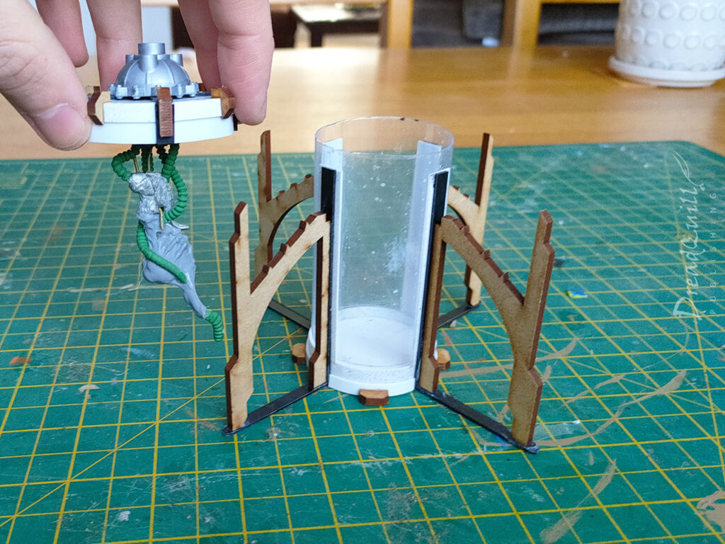
They were attached to magnetised ceilings so they dangled inside the vats and could be removed or changed by taking the lids off.

inquisitor 54mm mad science laboratory equipment wip 07

I didn’t glue the transparent tube into the base as I wanted some way of representing a broken vat when someone inevitably goes Hans Gruber on the glassware. I toyed with the idea of creating a broken insert but it was very complicated and I didn’t have enough plastic tubing to do it justice. Finished, not perfect!

inquisitor 54mm mad science laboratory equipment wip 10

The finished vats are pleasingly imposing. They take up a decent footprint with the gothic leggies and they’re wide enough that they could reasonably be used as cover (maybe not more than once), so that ticked my boxes for playability.

The inhabitants themselves were fun and quick to build, and the modular design means I can always add extras down the line if I need something scenario specific. A quick paint job and they’d be ready to go!

inquisitor 54mm mad science laboratory equipment wip 11
Autopsy tables

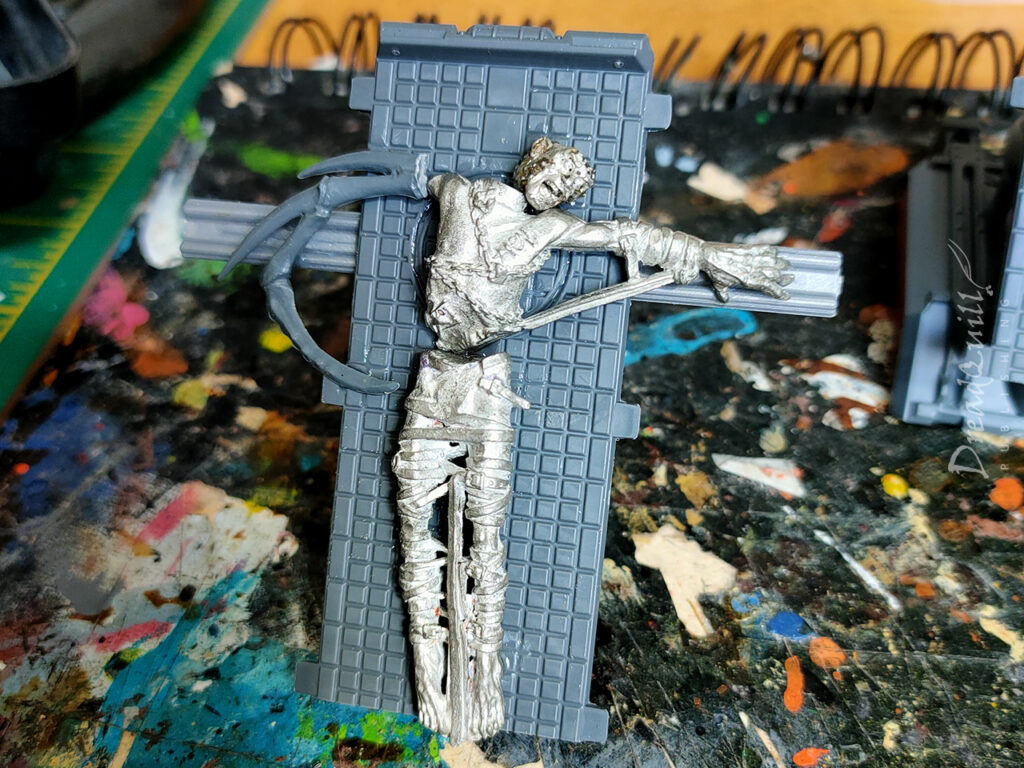
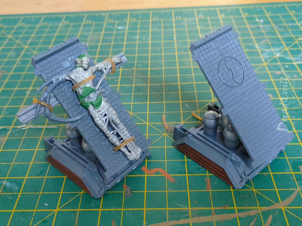
This idea was borne of the knackered Cherubael I had in my bits box, missing enough parts to render it unusuable as a miniature without a tedious amount of work. When flattened out though, it looked like a poor soul strapped to something with its abdomen opened up.

Cue strapping it to something!

inquisitor 54mm mad science laboratory equipment wip 03

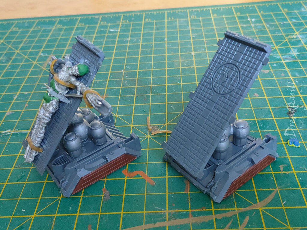
I had plenty of munitorum container parts left over from my freight wagons, and the roof/floor made a perfect back board to hold the guy up. I added some extra plastic widgets to secure the arms to, a weird bug arm (probably from the classic chaos spawn sprue) to build some visual narrative as to why this lad has been chopped open, and gave him Sergeant Stone’s shouting head that had the top removed. I think I envisioned modelling some kind of brain, but I just didn’t have time in the end. Just ship it!

inquisitor 54mm mad science laboratory equipment wip 04

I used an old rubber band to tie him to the table, and created some skkin flaps out of green stuff for the belly. I filled the cavity with globs of hot glue to create some organ-like shapes and added some spiky bits of metal to look like tools.

The whole thing was mounted on a raised base made from a side panel of munitorum container. It came out so well I made a second one, but this time without the test subject. More props are always better, and gives you more narrative options for creating scenarios down the line. What’s scarier than finding a body on the autopsy slab? Not finding a body on the autopsy slab…

inquisitor 54mm mad science laboratory equipment wip 05
Floodlights

These were delightfully simple to put together, but a pain in the ass to visualise. Of course such things must exist in the 41st millennium, but what do they look like? You can use modern designs as a base, but you have to trial and error lots of different pieces to give it that suitably over-engineered riveted skull-punk look that 40k goes for.

For the lights I used old superglue lids with chopped down bulbs from the Sector Imperialis kit (RIP, gone before your time). Chunks of sprue and ribbed pipe from the classic Tehnolog Chemical Plant set helped sell the idea they were retractible.

The legs were made from cut down buttresses from the classic Cities of Death terrain (RIP gone before your time), with a little control panel from the Necromunda accessories sprue.

inquisitor 54mm mad science laboratory equipment wip 02

On with the paint!

More art than science

Everything was undercoated in black, then a zenithal of grey. I removed the transparent plastic tube during painting, as I was unsure what to do with it but I knew I didn’t want it to get messy.

inquisitor 54mm mad science laboratory equipment 16

All the grey areas had Athonian Camoshade sponged onto them in random places to look like dirt and grime. When that had dried, everything got a drybrush with Deepkin Flesh to carry through the green tones.

inquisitor 54mm mad science laboratory equipment 23

The beasties inside hit with Reikland Fleshshade on the fleshy parts and Templar Black Contrast on the tubes – that was it! No need to be fancy, as they would be largely obscured by the glass anyway.

inquisitor 54mm mad science laboratory equipment 21

The glass itself was pleasingly straightforward. I have a pot of Tamiya Clear Green, which produces this incredibly toxic smell when opened, and produces an incredibly toxic effect when applied to miniatures. I used it to good effect on my Ambulls, and it always gets rolled out whenever I need some horrible goo effect.

In this case, I just slapped it on the inside of the tube and left it to dry, not worrying too much about it being patchy or uneven – it only adds to the effect!

inquisitor 54mm mad science laboratory equipment 19

The tables were painted much the same way – the only difference is the addition of everyone’s favourite Blood for the Blood God in key areas, and smeared a bit for visual effect.

The test subject was again just washed with Reikland Fleshshade on the fleshy bits and Agrax Earthshade on the straps. The chains were drybrushed silver and washed with Agrax again.

inquisitor 54mm mad science laboratory equipment 10

The floodlights I went a little wild with, adding two(!) extra colours to the palette.

The metal sections were painted Scorpion Brass and washed with Agrax, then silver was stippled over the top to look like chipped paint.

The lights were my first attempt at drybrushed OSL, and they’re effective enough to sell the idea that they are floodlights. I’d do them slightly differently now, having more depth of colour rather than flat yellow, and adding pure white to the centre of the bulbs where the light it coming from.

inquisitor 54mm mad science laboratory equipment 12

Overall, I love how well everything came out! I was sceptical through the process, especially of how the cloning vats would come out. I should have trusted the process – Tamiya Clear Green never lets me down!

My mind is fizzing with extra props I’d love to add to this collection, but I’ve closed the book on them for now. There’s enough to fill a board and the project is complete. Plus they look great in action!

inquisitor battle report catacombs

If you’ve enjoyed this (or any other) posts, please consider helping me out towards hosting fees on Ko-Fi. Thank you!

MOTB: Necromunda freight wagons

necromunda freight wagons 05
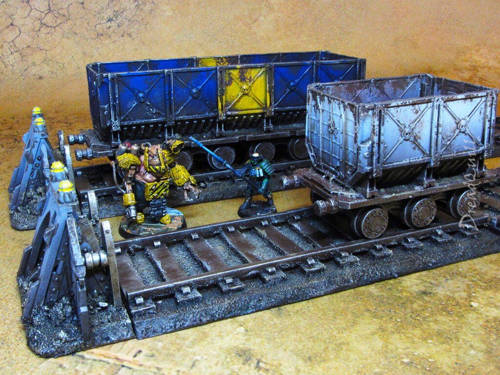
Finished product first!

Many years ago, when MDF scenery was still being invented, I acquired a very basic Wild West train set from TTCombat as a cheap and cheerful alternative to ruins and sandbags typical of most 40k terrain setups. Our gaming group were experimenting with Necromunda Community Edition (many years before the 2017 re-release) and were enjoying the narrative arcs that smaller-scale conflict could bring, and with it the need to have more interesting scenery to brawl over.

Time passed, and certain sets of scenery were trotted out for battle less and less. It wasn’t a concious decision, more a combination of how easy it was to set up, how well it fit the theme of the board, and what interesting combat situations could it open up.

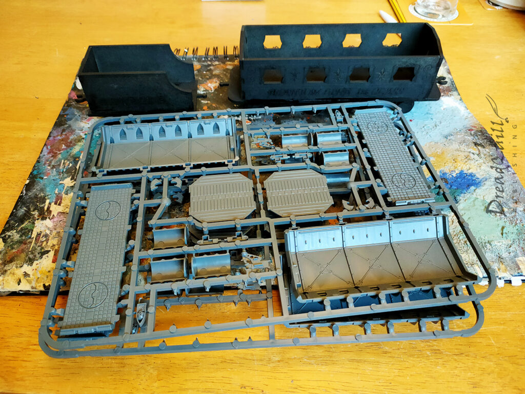
The Wild West themed train set rarely got high marks in those categories. The track itself was fiddly to set up as it came in 4-inch chunks that rarely stayed straight, and there wasn’t enough of it to cross the board fully, ending with some ugly terminations. The theme was tricky to match too – when Necromunda 2017 came round the whole aesthetic pivoted, and a passenger steam locomotive was rarely a welcome sight on the board. It also had limited scope for interesting play – the passenger compartment wasn’t large enough to have two models standing side by side, so it served only to block line of sight in a small area of the board.

I never even got round to painting it. The train had reached its terminus.

The restoration

The pandemic gave me an opportunity to refine my terrain collection. I already had a large number of MDF shipping containers (acquired at the same time as the train set), so had little desire to add to the pile with some leftover plastic Munitorum containers. I’d been experimenting with cutting them up for use in hab blocks I was working on, and was thinking about turning them into street furniture like garbage skips, so why not cut some more up?

The flash of inspiration came when I remembered the train set gathering dust – skip plus wheels equal fun – and I could rebuild the whole train set to be more aesthetic!

necromunda freight wagons wip 02

I had three carriages to play with – the train engine proper, the coal wagon, and a passenger carriage. I set the engine aside for a future project to concentrate on the bits that would eventually become freight wagons.

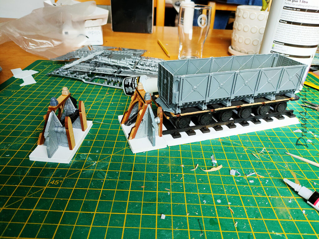
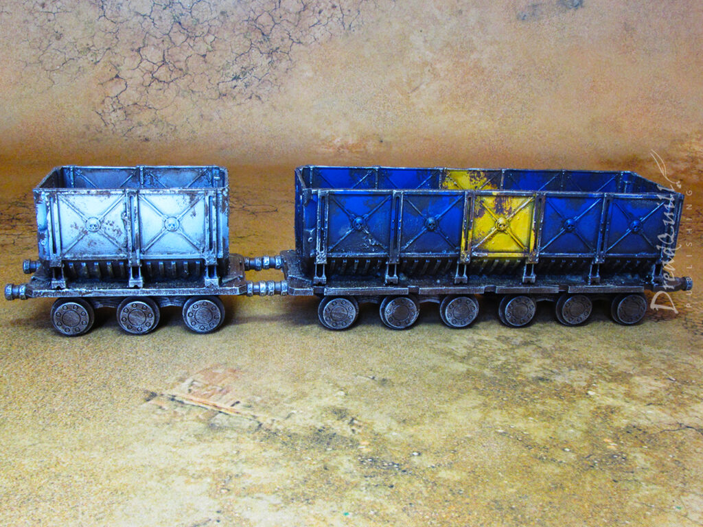
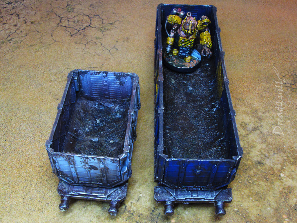
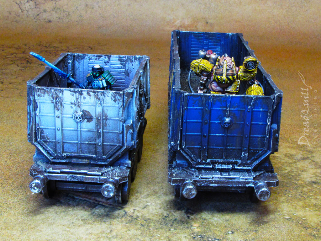
It was straightforward to cut the carriage beds free, leaving me with a flat surface to attach my cut up munitorum containers. They were two different sizes which meant being a being a bit creative with how I chopped up the containers, but pleasingly they were almost exactly the right size for a five-panel and two-panel wagon. I used up about 2.5 munitorum containers’ worth of panels constructing these wagons, so there’s still half a container in the box for a future endeavours.

The ‘future endeavours’ box

I smushed some putty and textured paint into the bottom of the containers help sell the idea that they’d been used a lot, and served the double purpose of elevating miniatures inside. I wanted it to be usable in both Necromunda and Inquisitor, so needed to be tall enough to provide cover to the tall miniatures, and short enough to be seen over by the short miniatures.

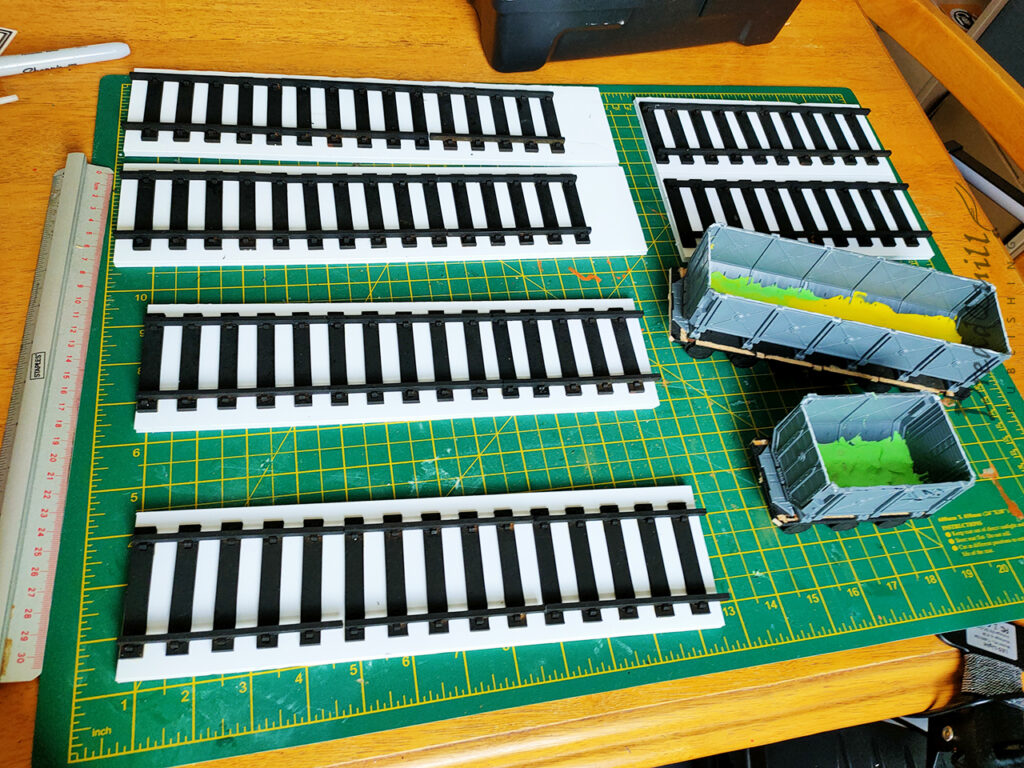
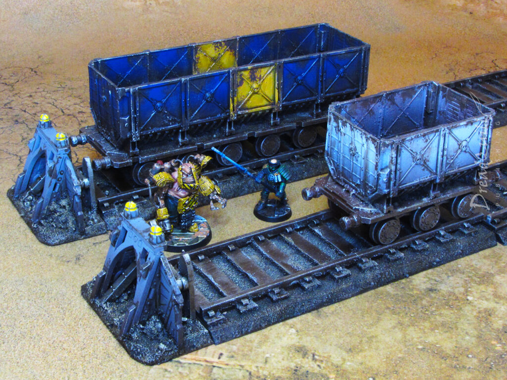
I also counted out the track pieces and grouped them together in sets of 3 (with a few left over for two sets of 2) and glued them to some foamboard in 12″ lengths. This would massively expedite setup and tear down, as well as giving me an opportunity to add some texture and colour to the track ‘base’ to tie them into their setting a bit better.

Buffering

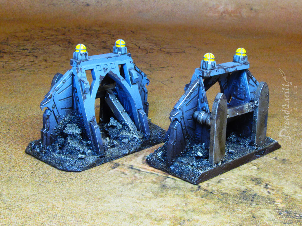
I was left with a few bits of foamboard left over and a desire to avoid the problem I had before of railway tracks ending in the middle of nowhere. It was time to break out the future endeavours box and build some buffer stops!

necromunda freight wagons wip 03

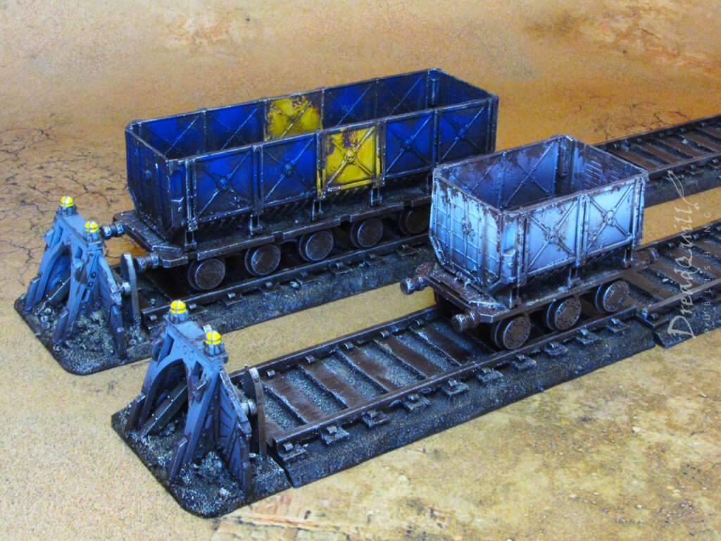
I wanted to make two so I could have two tracks next to each other terminating in the middle of the board, suggesting a depot or station of some kind. It also took a lot longer to create these from scratch than I thought, as I experimented with all kinds of designs built from plastic and MDF scraps from the box. The only thing I knew I wanted was for it to be solid enough to be used as cover by larger models. I used bits of sprue and cork to build up little piles behind the buffer to help sell the illusion of sturdiness.

I’d been experimenting with magnets in other projects, and couldn’t help but add some magnets to this project too. The little MDF hook-and-loop connectors on the original undercarriages were so flimsy they snapped off after two uses, so I wanted something a bit more sturdy. A pair of plastic pipes at each end, topped with a neodymium magnet, positive on the left and negative on the right. Although the wheels didn’t roll down the track it meant the carts snapped together neatly in any orientation, and I could drag them around the table if I wanted them free of the rails.

Finally, I bevelled the edge of the foamboard with a craft knife and painted on my sand and PVA. I foolishly didn’t weight the track sections down, convinced the rail sections would keep the foamboard from bowing while drying. To combat this, I applied a load of PVA glue to the underside and weighted them down so they bowed back towards their original position. Not perfect, but not noticeable any more!

Gonna paint your wagon

Painting these guys was a blast! Quite literally – nearly all of it was done with rattlecans. Undercoated black then brown, with the wagons masked off to be blasted with another few choice colours. The longer one was sprayed Ultramarines Blue, the smaller wagon was sprayed grey, then with a white zenithal, always taking care not to spray the undercarriage.

necromunda freight wagons 03

The mantra is finished, not perfect. All the metal areas got a rough drybrush with Leadbelcher and we called it a day on that. I masked off another area on the blue wagon and sponged on some yellow paint for a pop of colour.

necromunda freight wagons 09

Everything got attacked with Agrax Earthshade – dotting the rivets and lining the panels, and splashing it about the deeper recesses and interior. Athonian Camoshade was sponged on in key areas to add an extra layer of grime.

necromunda freight wagons 11

Typhus Corrosion was stippled on with a large gammy brush, paying closer attention to corners and edges that would be likely to get knocked about during regular freight use

When that had dried, Leadbelcher came out again on a knackered old brush to roughly touch up some heavy-traffic edges where exposed metal would be showing through.

necromunda freight wagons 10

The buffer stops had little lights on the top, which I toyed with the idea of doing some OSL effect for, and quickly slapped that thought out my head. A big blob of bright yellow paint did the job.

The dirt/sand on the foamboard and interior of the wagons also got a healthy dollop of Agrax in the deepest recesses, lightly drybrushed with Ushabti Bone to highlight.

necromunda freight wagons 08

And they were done!

Final destination

I’m overjoyed with how they came out. A simple idea cleanly executed, they add some interesting points of interest to any tabletop you put them on. The carts are practical and encourage creative gameplay, and they look at home in any kind of environment. They’ve already seen use in some games of Inquisitor, most notably an unpainted version in Dust-up at Distro-19 and an unreleased episode where someone pushes a doomsday payload across the board.

When I was painting them, I felt like I was being sloppy and cutting corners. Looking back on them now, I can’t see any of those corners cut – just a cool set of terrain that I can’t wait to get back on the tabletop.

Now all I need is the train engine…
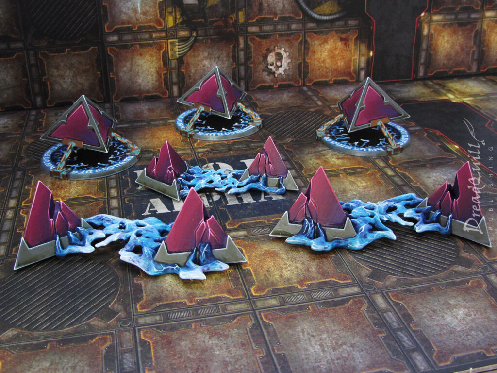
necromunda freight wagons 04

MOTB: Yu’Vath crystal warp generators

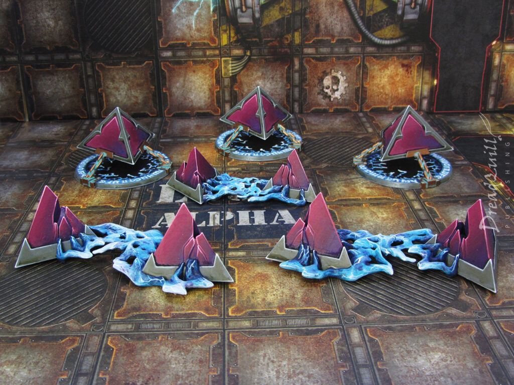
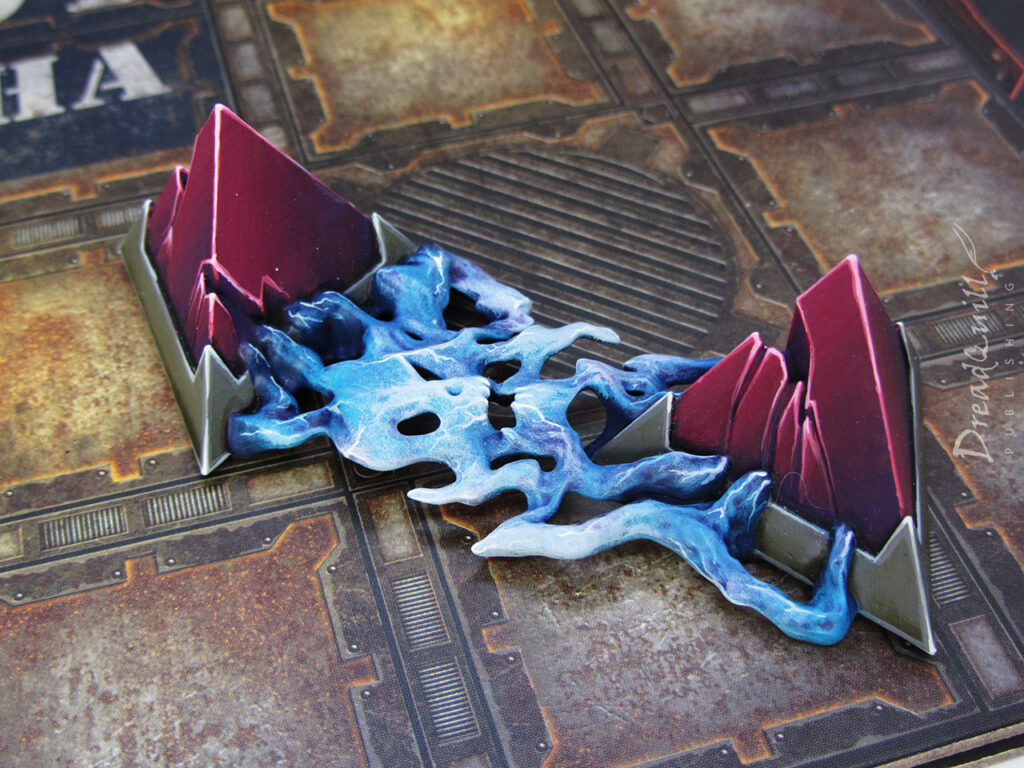
yu'vath crystal warp generators 02
Finished product first!

In the Before Times I picked up a bunch of weird Age of Sigmar scenery that I thought would work really well for an Inquisitor campaign I was running at Asgard Wargames. Papa Nurgle had other ideas for that adventure, and the plastics were consigned to the bits box for a rainy day.

Having some free time on my hands over the pandemic (and with another Inquisitor campaign planned) gave me the impetus needed to put the finishing touches on them.

pour one out

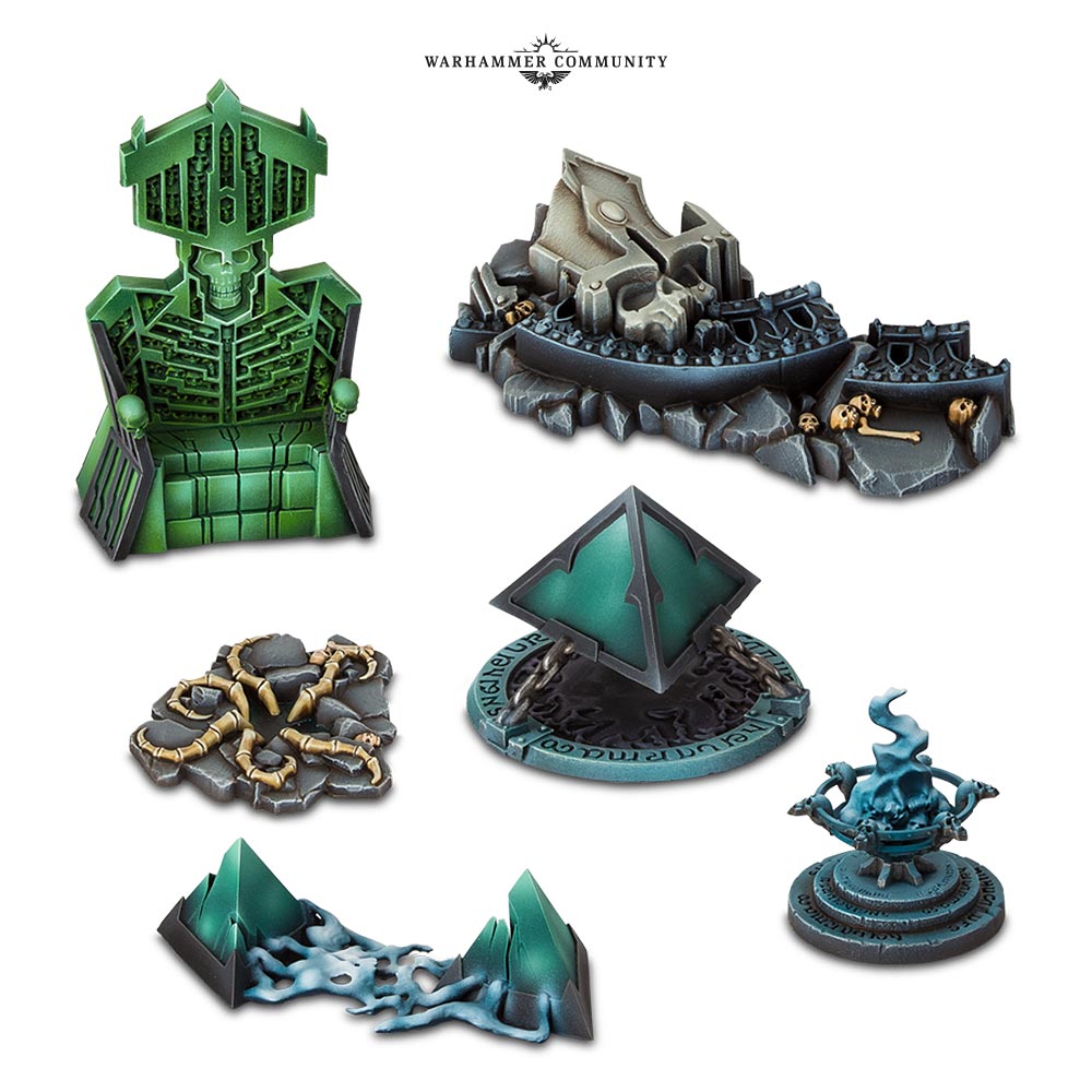
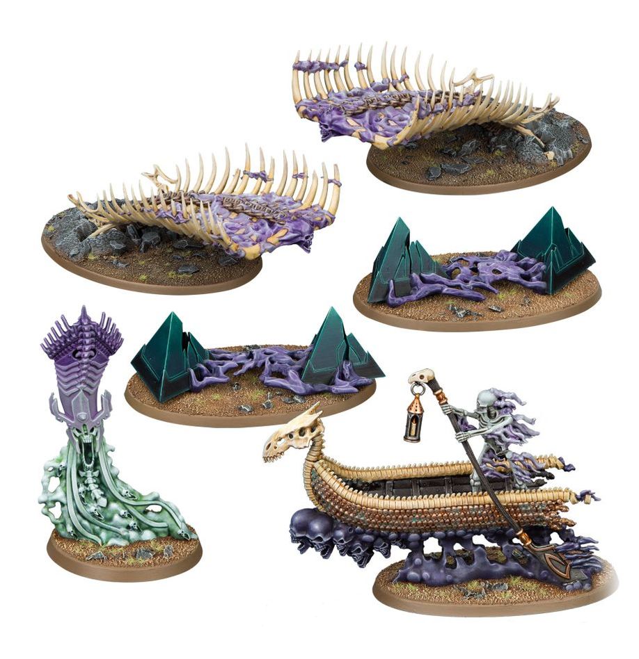
The two sets that drew my eye were the Arcane Hazards scenery kit for Warhammer Underworlds and the follow-up Forbidden Power endless spells for Age of Sigmar, now sadly very out of production.

I was drawn by the ancient undead empire aesthetic that they’d gone for with the new Ossiarch Bonereapers range, and I’m a sucker for giant floating crystals radiating malign power.

warhammer underworlds arcane hazards scenery set

I nipped over to ebay to grab some more of the floating/broken crystals, as I knew they’d be more useful as terrain if I had a few of them. Luckily many people were buying and splitting the Forbidden Powers box, which had some of what I needed.

Age of Sigmar Forbidden Power Endless Spells scenery kit

No conversions needed, they just needed a splash of paint!

Cerveza Cristaaaaal

Painting this set was time consuming but satisfying. It was long before I had my airbrush, so everything was done the old-fashioned way – wet blending layers.

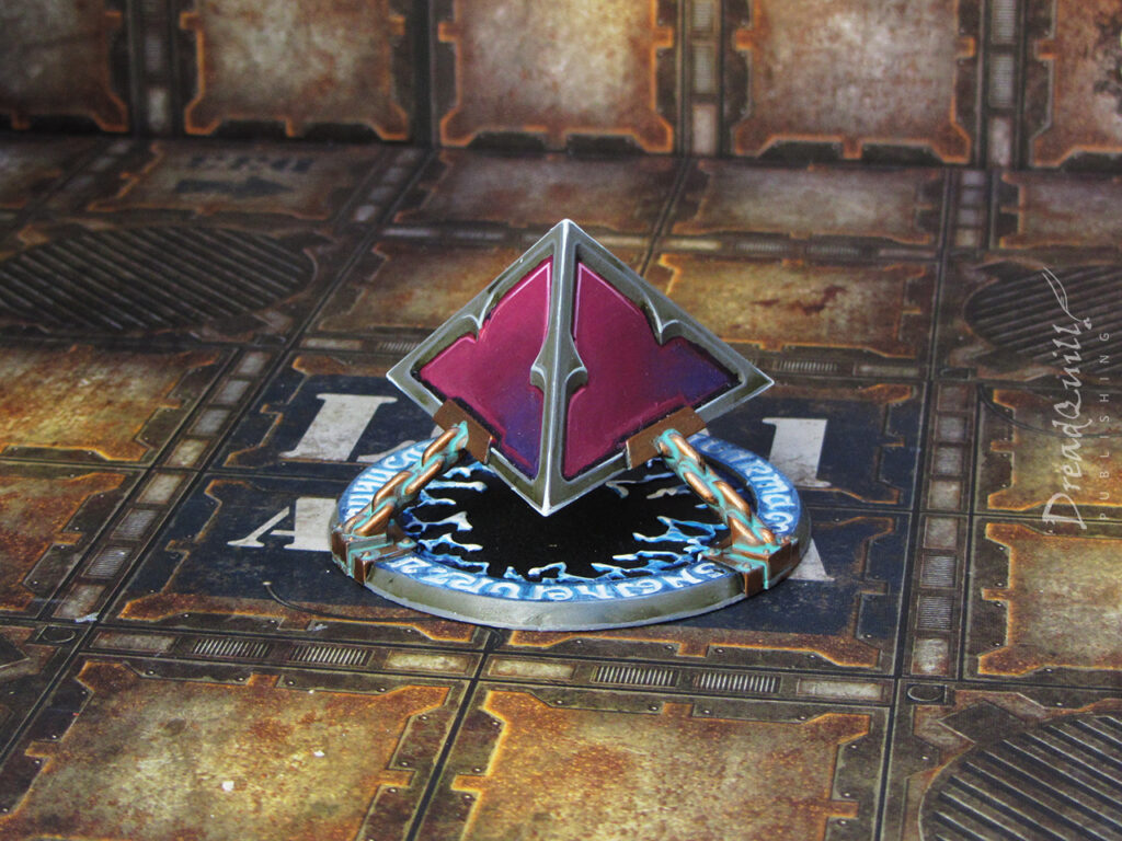
I based the colour scheme off previous crystal sets I’d done so they would visually tie together if they were present together on the board. The plan was to use them as Yu’Vath creations – perhaps as some strange power generator or warp artefact – so they needed to have a colour scheme that matched other Yu’Vath doo-hickeys I had.

They’re perfect at 28mm or 54mm scale, so they work really well as floating hazards for Inquisitor, or larger centrepieces for any of my 40k RPG games, or even Necromunda!

yu'vath crystal warp generators 01

Starting with a black undercoat, the crystals were painted by layering colours in order, going from darkest to lightest.

Xereus Purple > Screamer Pink > Pink Horror > 50/50 Pink Horror and White Scar mix for the edges > Pure White Scar dotting the corners

yu'vath crystal warp generators 05

The blue energy was painted in much the same way, but using drybrushing and stippling rather than layering to create a different texture.

Kantor Blue > Lothern Blue > (bit of Naggaroth Nightshade wash dabbed in) > Lothern Blue > Blue Horror > 50/50 Blue Horror and White Scar mix. Electricity was painted on in Blue horror and finished with White Scar for added vim and vigour.

yu'vath crystal warp generators 03

Grey sections were Mechanicus Grey washed with Athonian Camoshade, and highlighted with Celestra Grey. The chains were Brass Scorpion, washed with Nuln Oil, then hit again with Nihilakh Oxide.

Simple but effective!

yu'vath crystal warp generators 04

I’m very happy with how they came out in the end. I had some emotional hangups about returning to them as they seemed like a cursed artifact – whenever they appeared they killed the campaign! I was able to push through and see them to completion though, and I’m glad I did.

The second Inquisitor campaign also never saw completion, largely due to illness at the last minute (Nurgle! Again!), and too much time passed to rope people back in. Perhaps a grand finale at Warhammer World is what’s needed…
Watch this space!

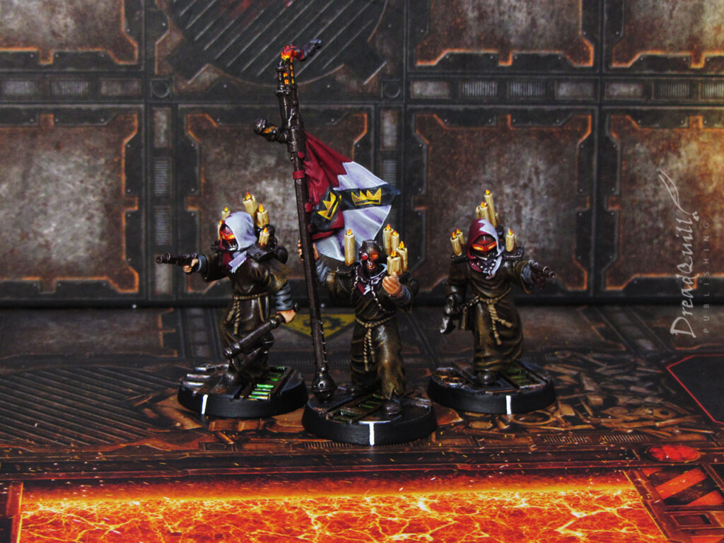
MOTB: Necromunda Promethium Guild – Mercator Pyros

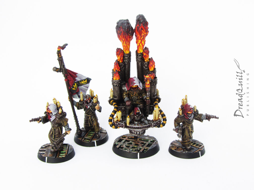
Finished product first!

Back in the heady days of 2022 I was approached to do a guest post for Anvil Industry off the back of some Chaos hoodlums I had been showcasing on social media. I was generously offered some store credit to make basically anything I wanted in exchange for writing up a guest post for them (an offer I would take up again in a heatbeat if you’re reading this xoxo).

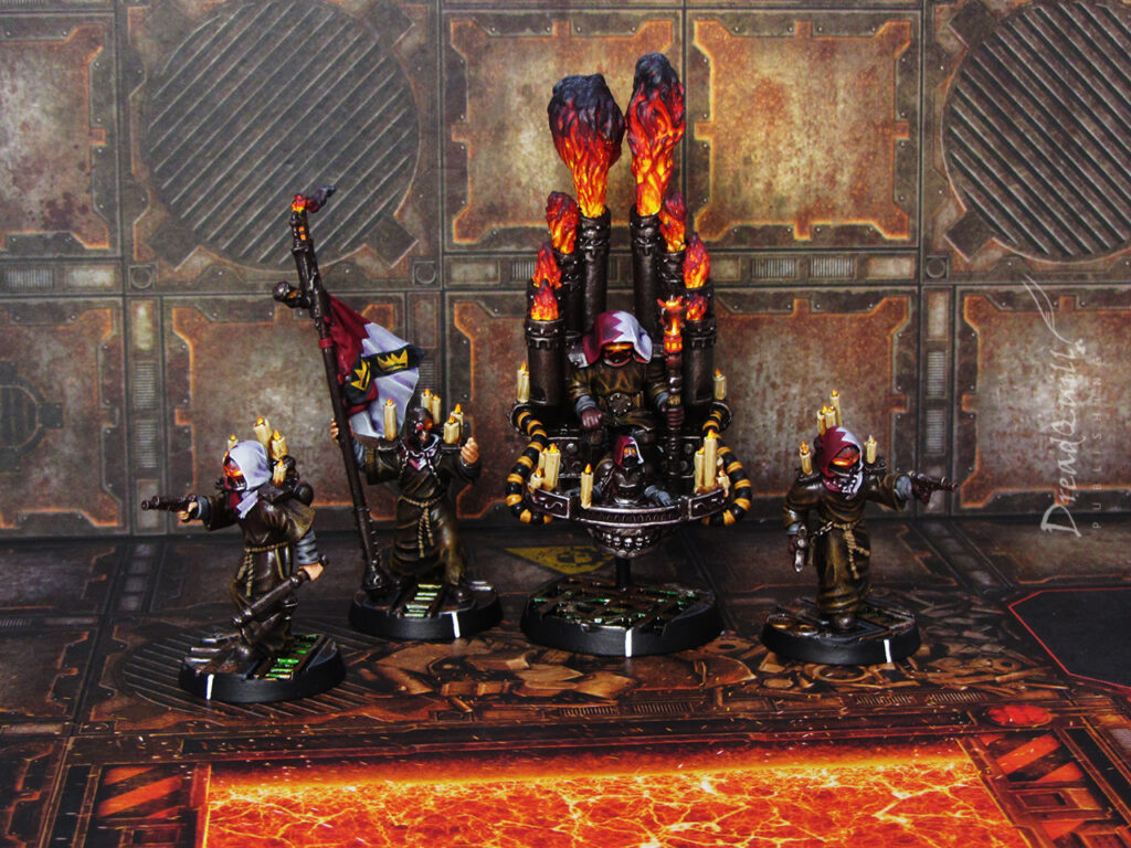
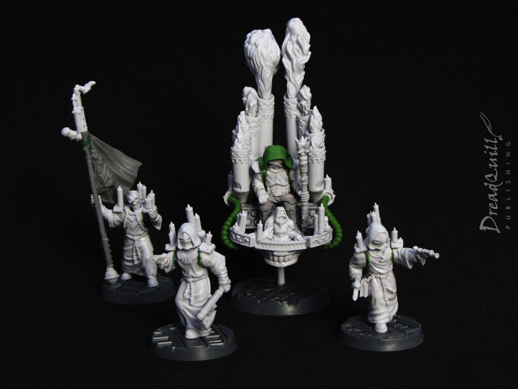
I had lots of ideas of what to spend my sweet sweet creds on but I settled on my one true love: Necromunda. I’d recently given myself the task of recreating all the Guilder delegation sub-gangs without spending a penny on them – just with odds and ends from the bits box. I’d already finished the Slavers’ Guild, and had the Water Guild and Corpse Guild semi-assembled, so why not round it off with the Promethium Guild?

Although the parts weren’t from my bits box, I wasn’t techically spending any of my own money. Necromunda is nothing if not a game with weird loopholes, so I checked with my Arbitrator (me) who said it was an acceptable interpretation of the rules, so I went ahead and put my order in.

Mercator Pyros Guild delegation here we come!

Fuelling the project

I encourage you to check out my full post on Anvil’s website for a full breakdown on how I assembled everything (including extra parts I used from my bits box), but the parts list I ordered is here:

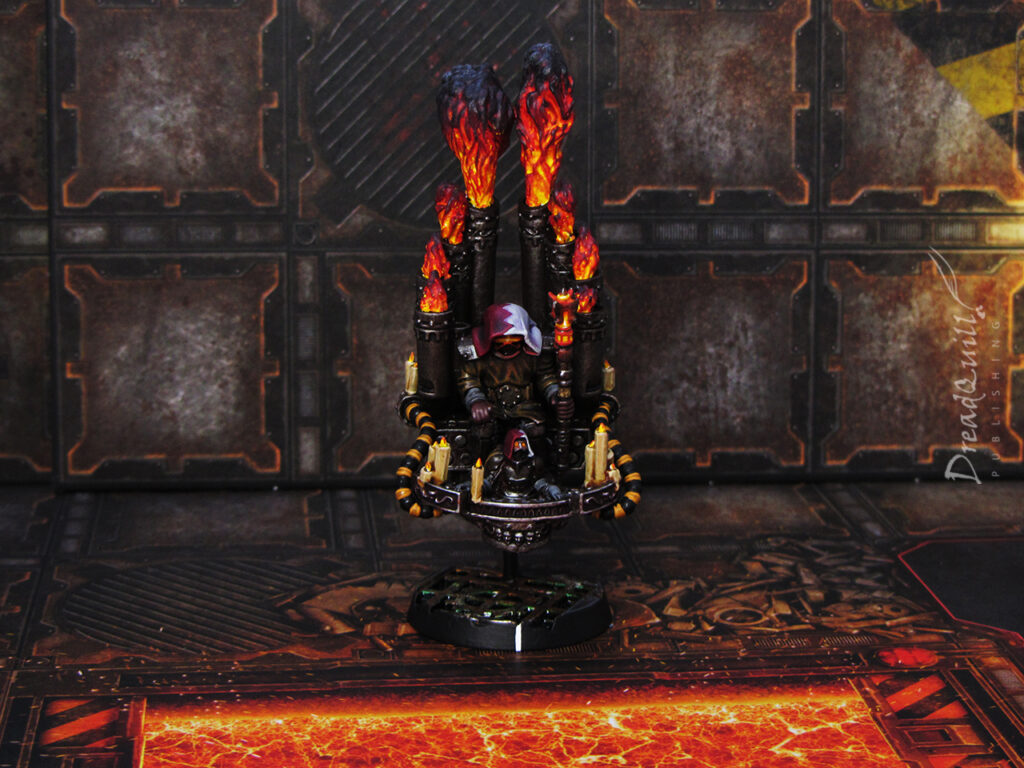
It took a lot of wrangling, finagling, jiggering and pokering, but I’m very happy with my Power Guild eventually came out.

necromunda anvil industry promethium guild wip 02
Remix to ignition

The bulk of the colour scheme had been decided for me: FIRE! This naturally terrified me as I hate painting flame effects, and have managed to avoid doing it for nearly all my life. In fact, I’ve only very recently adventured into painting flames with my Bedlam Feast firebreather. I just needed to step out my comfort zone and get ready to paint lots and lots of thin white and yellow layers over a black undercoat.

necromunda promethium guild proxies 01

With the colour palette being mostly yellow/orange/red from all the flames, burning eye sockets and candles, I wanted some muted colours for the robes and metal. This was done with the now-popular slapchop method – drybrushing grey/white over black, then applying washes.

necromunda promethium guild proxies 11

The candles were picked out with Ushabti Bone and any knots/cords were highlighted with Zandri Dust.

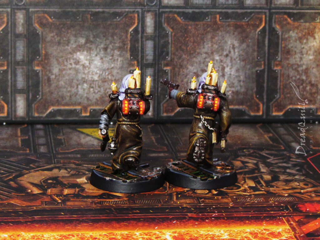
All members of the Promethium Guild have a weird extra special rule that allows them to detonate a photon flash grenade when they’re removed from the board, so I wanted to represent this instability with an internal glow to their armour.

I picked eye sockets (for rule of cool) and their backpack vents. I was (and still am) experimenting with OSL/glow effects, and for this project I did it the old fashioned way – starting with the light source and painting outwards (with lots of retouching of mistakes).

It started with pure white in the middle, with a few layers of yellow glazed over the top on the deepest recesses. Light orange was painted onto the inner recesses of the vents, then continuing outwards with darker reds. A final layer of Mephiston Red mixed with Lahmian Medium was added to nearby corners and edges to emphasize the glow effect. I think it came out pretty well!

necromunda promethium guild proxies 18

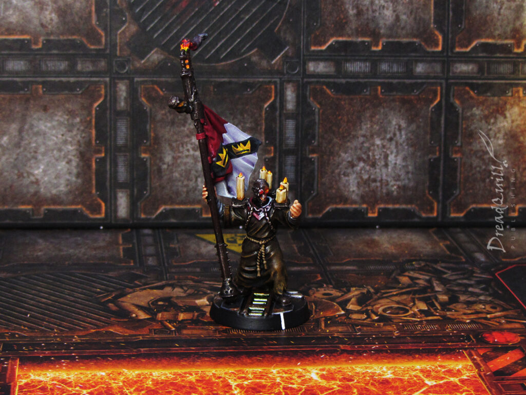
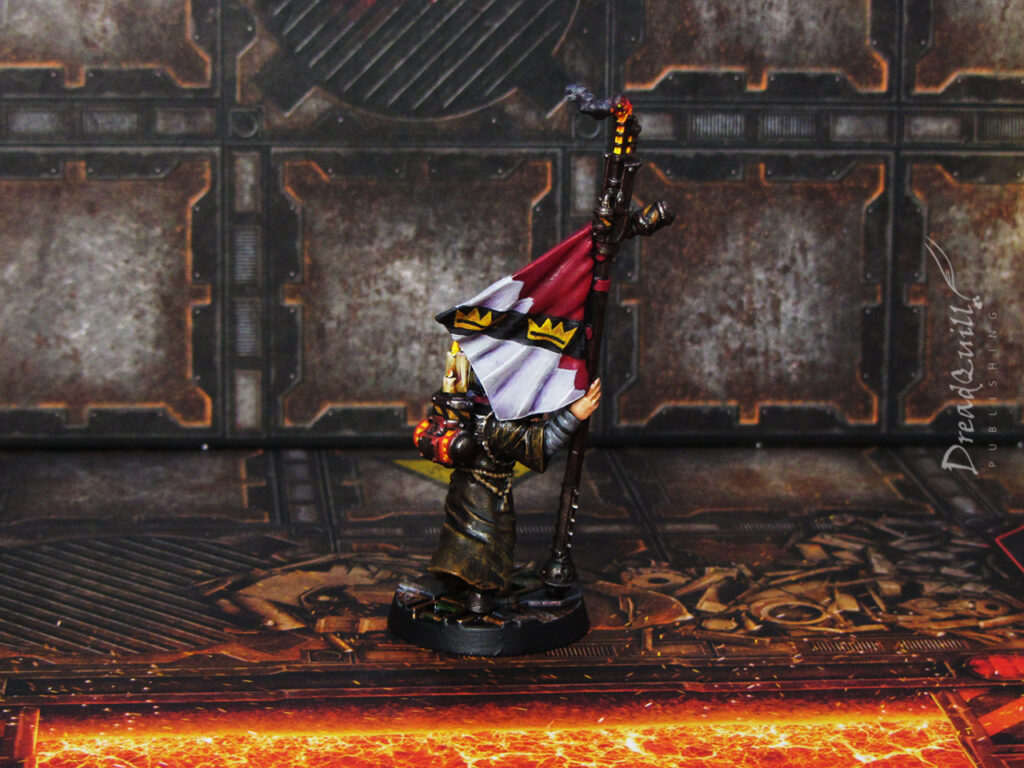
Another challenge I’d given myself was constructing a guy with a banner. He’s a Pyromagir Champion with a cult icon, which could be represented by absolutely anything, but I chose something that required some freehand painting. Ah well.

I needed some heraldry to tie the guild to some distant masters, and I had just the ticket. An organisation kept poppin gup in my RPG sessions – the Collepan Fuel Network – a bunch of power-monopolising ultra-bastards headed by a rival of one of our player characters.

necromunda promethium guild proxies 12

I enjoy designing flags and heraldry but I hate painting flags and heraldry, so I needed a compromise. I settled on this red/grey design, with a black strips covered in crowns crossing both fields. I figured the Collepan Fuel Network do their work on both hellishly hot worlds and frozen ice balls (the red and white fields), but ultimately they’re digging for promethium (the black band), which is where the family gets both their literal and social power from (the three crowns). A bit on the nose perhaps, but it’s not a statement piece if people don’t understand the statement.

necromunda promethium guild proxies 13

The big boy was the most fun to paint. I didn’t realise at the time of ordering that the little guy in front would be so little – I thought he was a full-sized miniature, but he’s actually a little clockwork puppet! It makes for a fun composition, even if it does look a bit like the main chap is watching him play some sick tunes rather than staring moodily off into the middle distance.

necromunda promethium guild proxies 05

The hardest part of painting all the fire was having the patience to see it through to the end. This was pre-airbrush, and I’d undercoated them black with the intention of having them in a dark colour scheme.

You have to go through so many stages of waiting for paint to dry while the model looks like utter crap before it starts to come together. Easily half a dozen layers of thinned-down white paint around the hottest areas, then layering on another half a dozen thin coats of bright yellow, then orange, light red, dark red, then black, then a touch of grey for the wisps of smoke. It was only when the red layers started to go on that I started to see the effect come together, which was a relief after several evenings of watching paint dry!

Painting fire is simple but time consuming – the hardest part is trusting the process. I’m a believer now!

necromunda promethium guild proxies 08

In conclusion I’m overjoyed with how they came out. There were quite a few obstacles that could have been the diesel in the project’s petrol engine – trying to get all the bits to fit together, freehanding a banner, painting fire effects – but they all came together so well at the end!

I’m very happy with my Promethium Guild and I can’t wait to get them on the tabletop. Just the Corpse Guild and Water Guild left to do, but they’re not far away now…

MOTB: The Widower

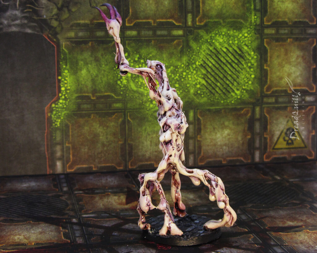
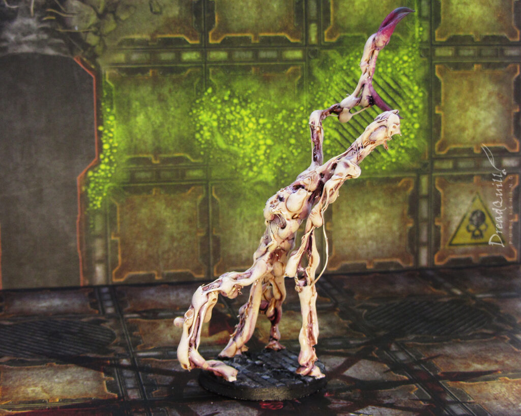
Finished product first!

“Quaddis is a strange world, long the plaything of the vice, vainglory, and eccentricity of the powerful and great of the Calixis Sector and far beyond. It is a place of strange tales and stories, and one of the oldest is that of the Widower – monster, changeling, creeper in the darkness.

The Widower of old was said to be the Haarlock’s warder and spy and – when needed – their peerless assassin – a thing that no weapon could kill and against which no lock could bar entry.”

Dark Heresy – Tattered Fates
Dark Times

In the Before Times I was running a semi-regular Dark Heresy campaign loosely based on the Haarlock Legacy trilogy by Fantasy Flight Games. During the Tattered Fates sequence, the characters wake up in a pit having lost all their equipment and have to fight for their lives against horrible pig-faced butchers and their broken creatures.

Later, they emerge on to a pleasure planet about to undergo a Purge-style festival. One of the many creatures that stalks them is the Widower, an ancient sentinel of molten flesh around which the story revolves. Naturally, it needed building.

A mythical beast

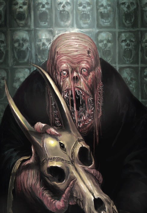
Enticingly, Fantasy Flight included only one piece of art that is probably the Widower (it isn’t explicitly stated, but it’s a safe bet):

Probably the Widower, courtesty of Fantasy Flight Games

This doesn’t give a lot to go off, let alone what model to use as a base. At the time I had a job that was quite, uh, lax on workload, so I had a lot of energy to trawl the internet for inspiration.

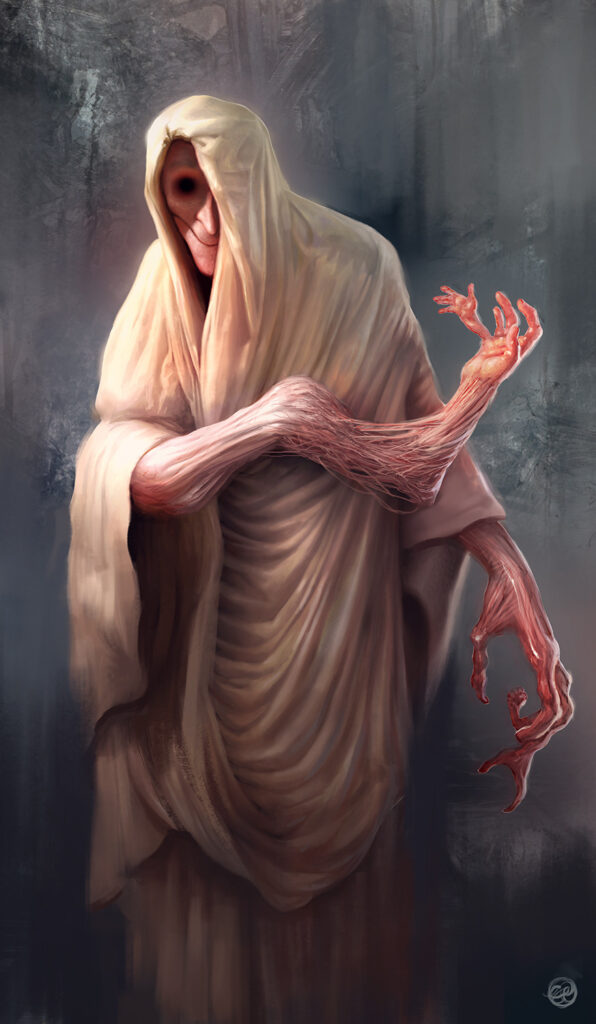
I found this rather excellent piece from Ryan-Alexander-Lee on Deviantart, that these days might be seen as a commentary on AI art, but back in the heady days of 2018 it was as spooky as ever. The chilling uncanny-valley smile, the morphed hands, the concealment under a funerary shawl.

Hessyst by Ryan-Alexander-Lee

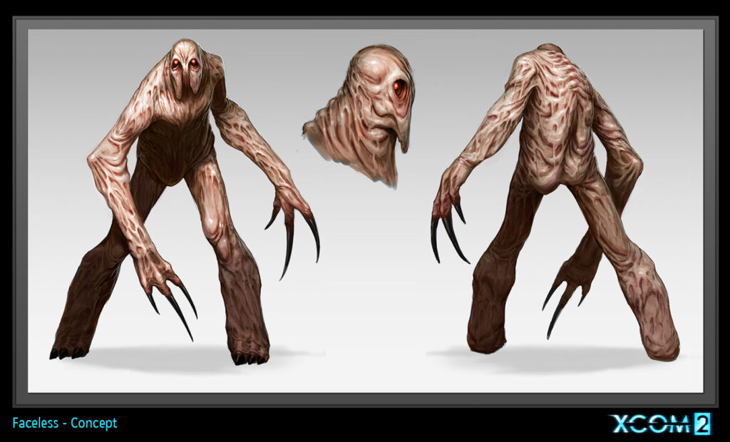
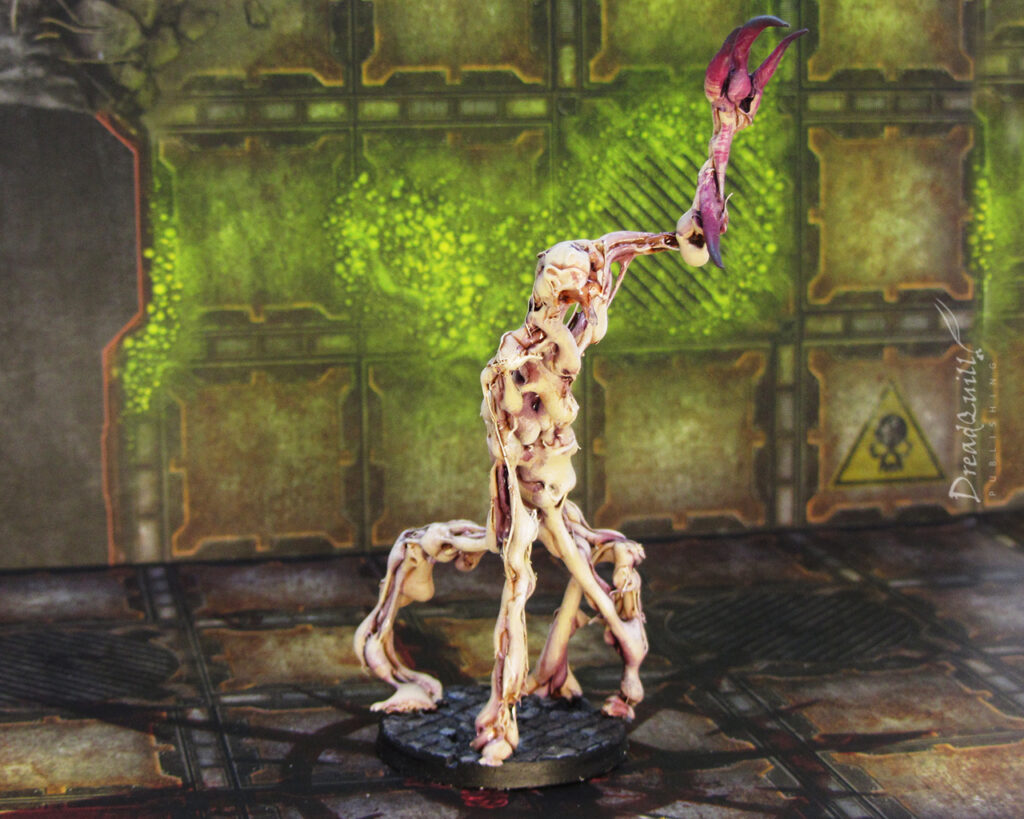
It was also the height of the XCOM rejuvenation, and XCOM 2 brought us the rather excellent ‘Faceless’ enemy, which had the molten waxy skin described in the adventure book that I was looking for.

It was slightly too humanoid for me (two arms and two legs for an unknowable ancient death machine? Yawn) but the texture of skin, colour palette, and even the hooked hands made the final cut for the design. Now, what on earth could I use as a base?

Faceless concept art for XCOM 2
Melting a monster

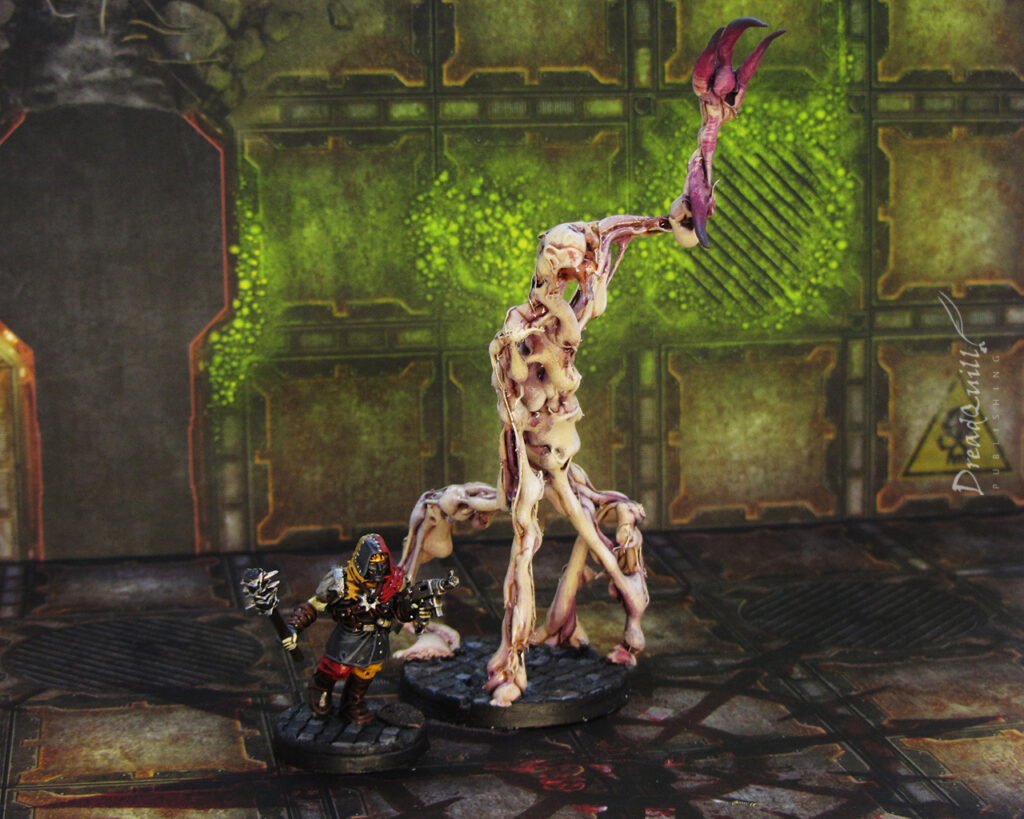
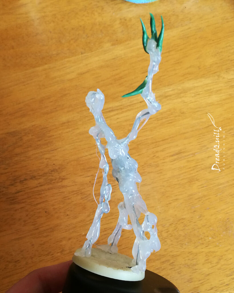
It became apparent I wasn’t going to find something that suited the brief. At the time I had been playing around with a revolutionary new tool called a hot melt glue gun, and I wondered if it was possible to simply build the Widower out of glue and save myself a bunch of cash and time.

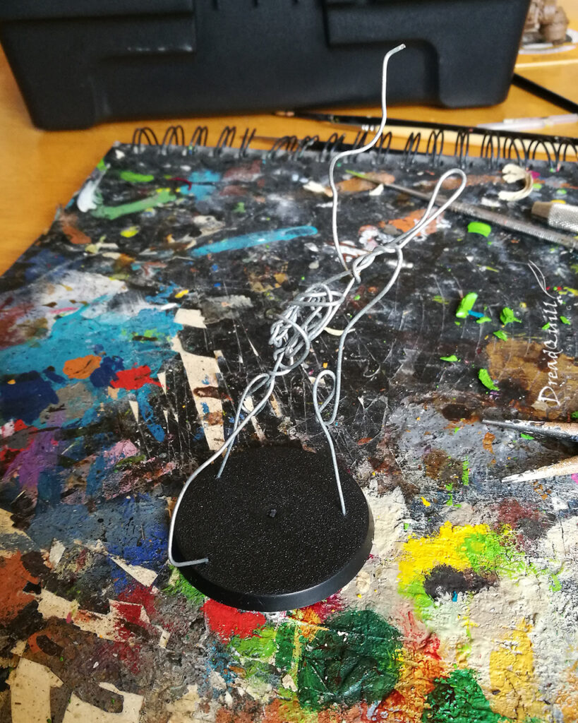
It started with drilling a few holes in a 40mm plastic base and getting some gardening wire I’d had lying around and just wrapping it around itself in weird shapes.

I was going for a rough tripod structure for balance and weirdness, with something resembling a head at the top and a raised arm to put the “weaponry” on.

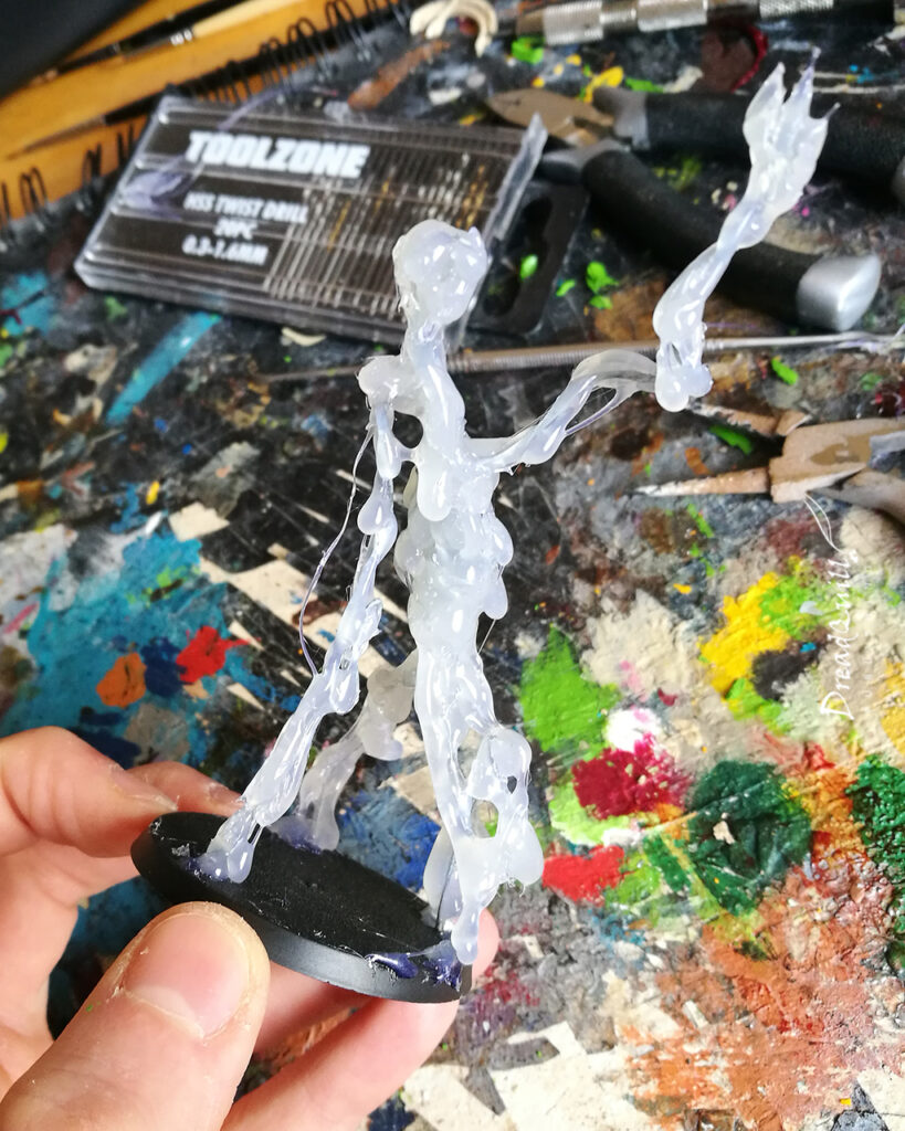
Then blast it with glue!

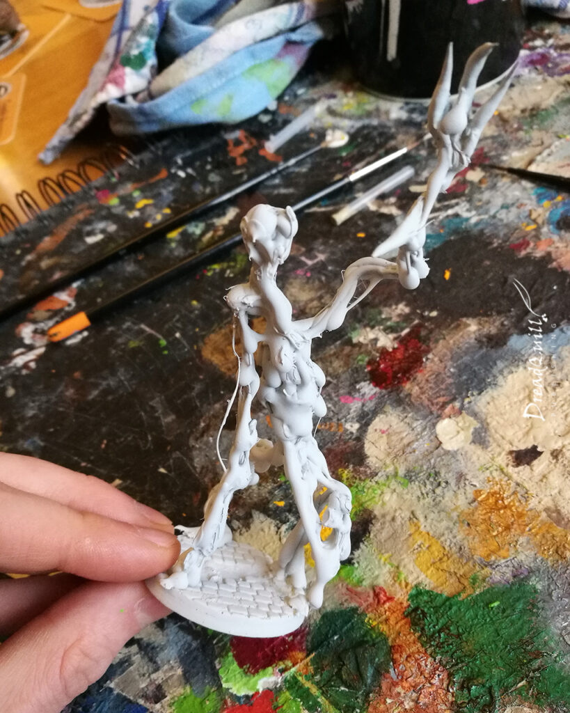
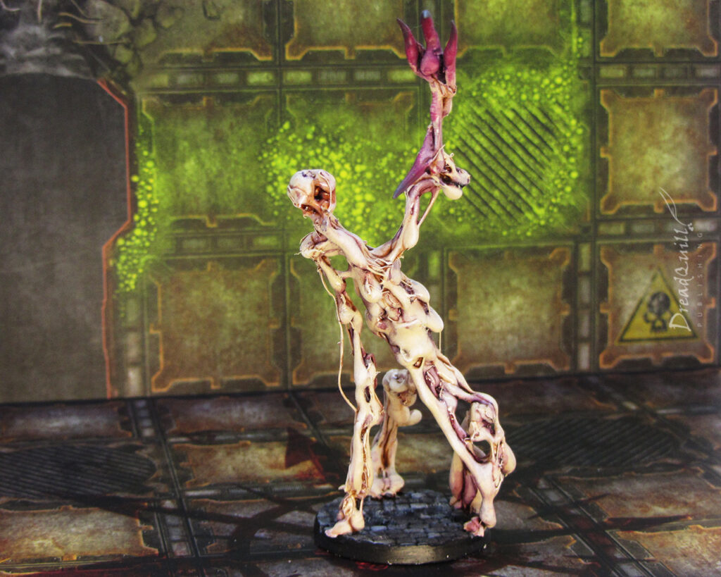
I liberally doused the frame with the hot melt glue gun, trying to get as many gooey stringy bits as possible. I really let it dribble. I tried not to have too much in the way of musculature or recognisable features as I wanted to be really weird and alien.

Once it had cooled, I applied a second more delicate layer of glue to create more bumps and ridges to give the washes something to sink into.

The only editing I did after the glue was to create a few spikes out of green stuff and add them to the raised hand. I liked the Faceless design with the darkened claws to highlight where the danger zone is, and I wanted my Widower to have something that looked like it would really mess you up.

It was also carefully pried from its base and glued to a custom resin one I had acquired for my other Bedlam Feast cultists. Little did I know how far ahead I was planning, as this would also double up as my Warp Horror/Chaos Spawn for my Chaos Necromunda gang, and having matching bases is vital to the aesthetic.

With it soundly dried, I hit it with a white primer and it was ready for some paint.

Quick and dirty

That first coat of primer is always a thrilling experience – seeing a random selection of pieces and colours finally unified. This was a particularly exciting project to see undercoated, as the model had been completely translucent until this point. It was only after seeing all the undulations in gross detail was I really convinced with how well it had come out.

So many undulations! With this sort of texture, painting the Widower was a breeze.

First, I splashed the whole thing with Reikland Fleshshade. Darker recesses were given a Carroburg Crimson wash, and everything was drybrushed with a light flesh tone to pick out the most extreme edges.

As a final alien touch, the darkest areas got a little dab of Druchii Violet wash.

The ‘claws’ were roughly drybrushed in darker shades of Screamer Pink and Xereus Purple to draw attention to them, similar to the Faceless.

The purple areas then got a hefty dollop of gloss varnish to up the goo factor, leaving the outer areas matt. This helps give it an otherworldly, ever-changing look to it.

The base was painted in the same way as the Bedlam Feast cultists – pick out different cobblestones in different shades of grey, wash with Nuln Oil, light drybrush of a mid grey, then random patches of Typhus Corrosion to taste.

Wrapping up

I’m overwhelmed at how well this horrible beastie came out. For something I did basically no testing on, it came out perfectly first try. I guess that’s the nice thing about making a grosteque flesh monster from hot glue – it’s difficult to make it look like anything other than a grosteque flesh monster.

I particularly like how, although it has no face, from some angles you can almost make out one or multiple faces. It sort of has arms that are sort of legs. Its torso looks like it’s about to spew out more limbs. It’s monstrous.

Maybe one day I’ll return to that Dark Heresy campaign. For now though, it has taken up service as a Brute in my Bedlam Feast Necromunda gang, using the cultists as a gang. I’ve been putting off painting their leader for a while, but now with another campaign on the horizon, perhaps it’s time.

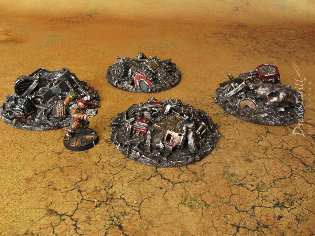
Outlander scrap prospecting site

Last year I ran a Necromunda Outlanders campaign for my friendly local game store Asgard Wargames, my first proper ‘public’ game with players outside my immediate friend circle and a campaign format we had very little experience of.

Most appealing to my deadline-averse hobby nature was that every scenario required specific objective markers or scatter terrain. The perfect excuse to plunder the bits box!

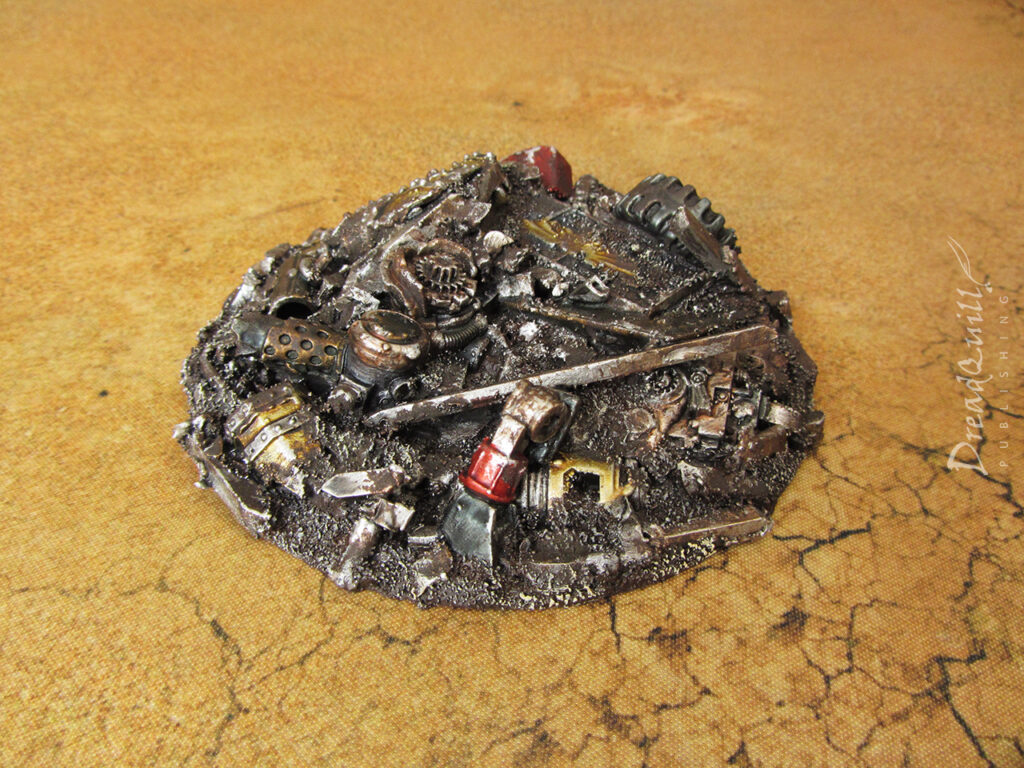
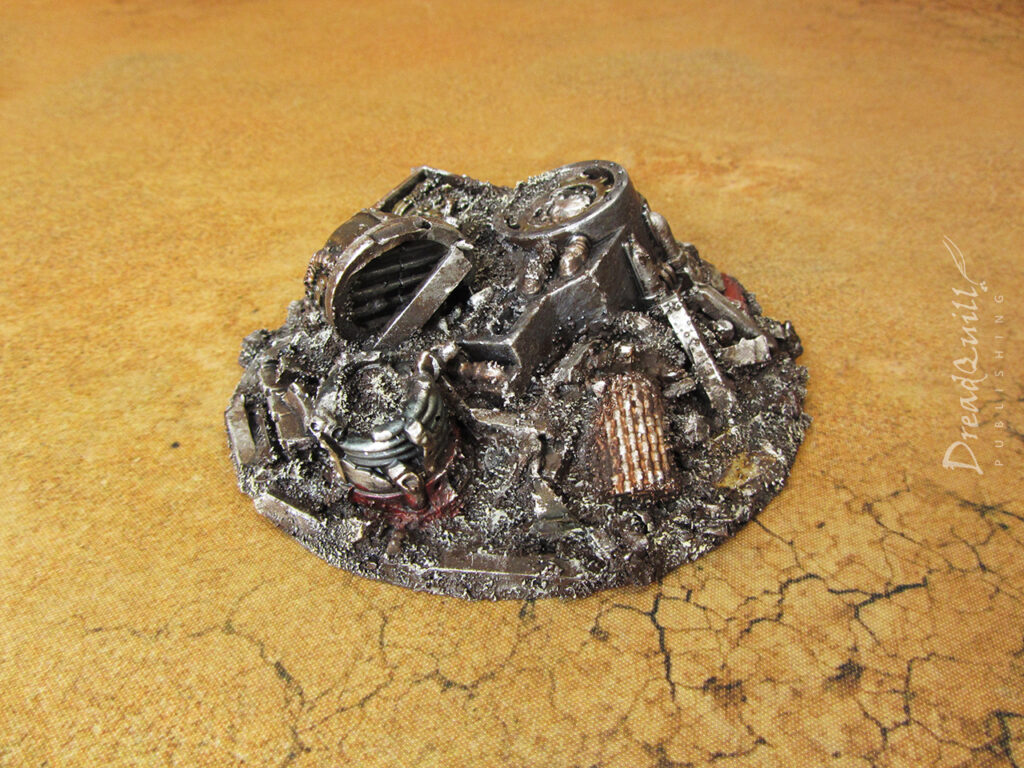
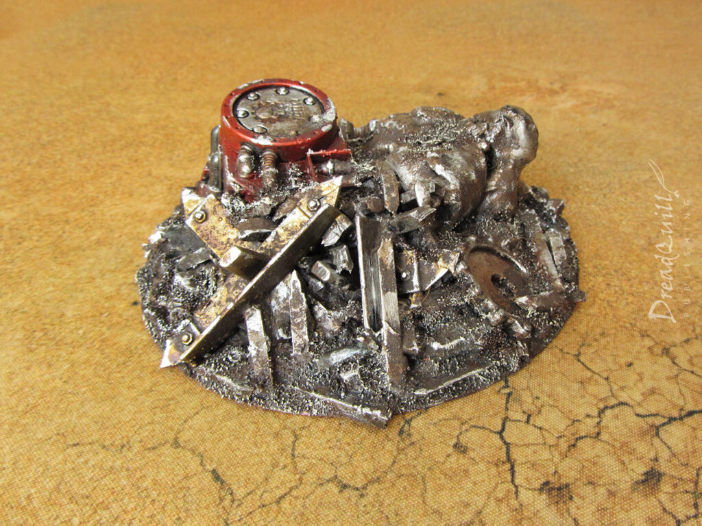
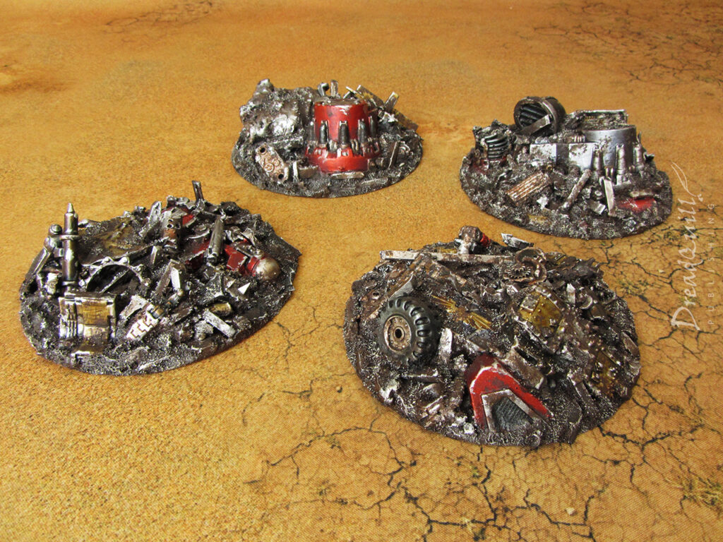
Finished product first!
Mining for parts

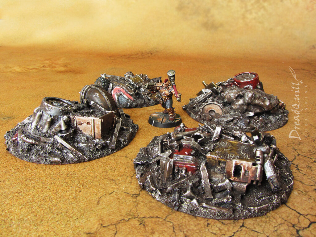
First scenario to get a look in was Mining Expedition, where gangs have to battle over and search through four ‘prospecting sites’. The only stipulation from the scenario was that they needed to be about 4″ in size.

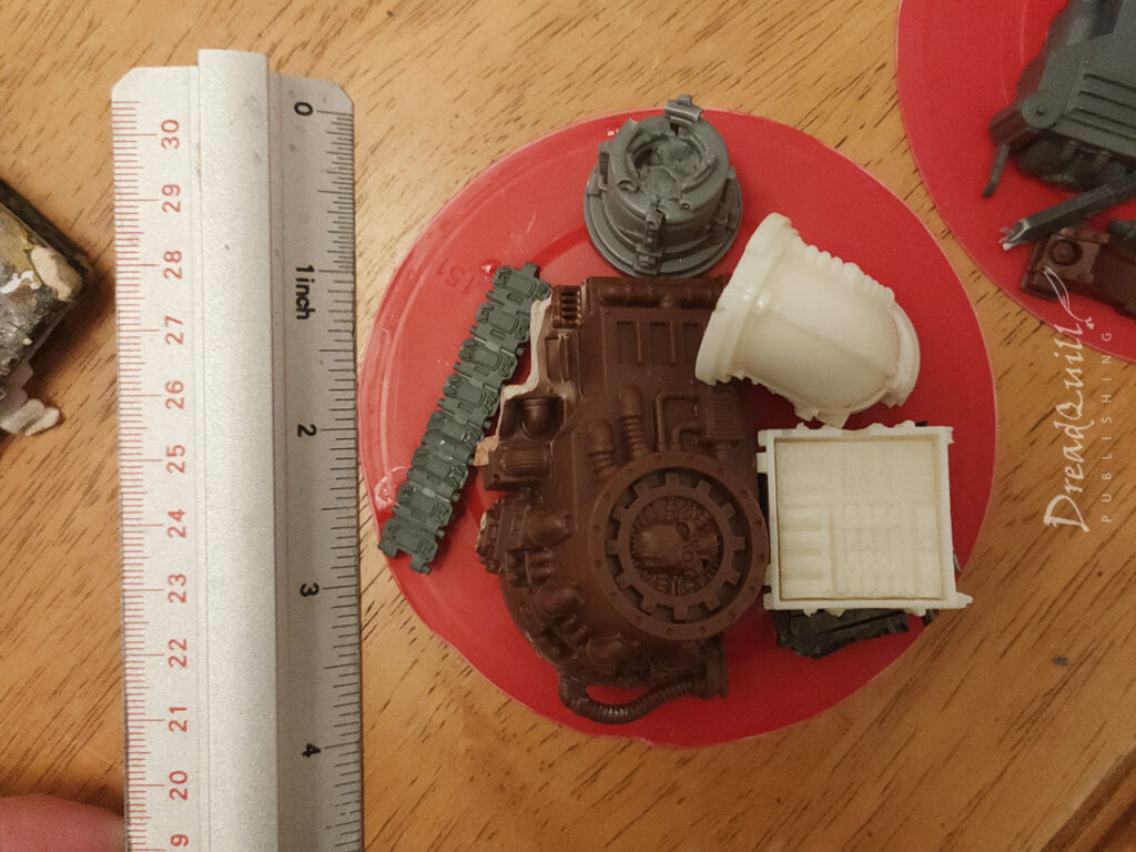
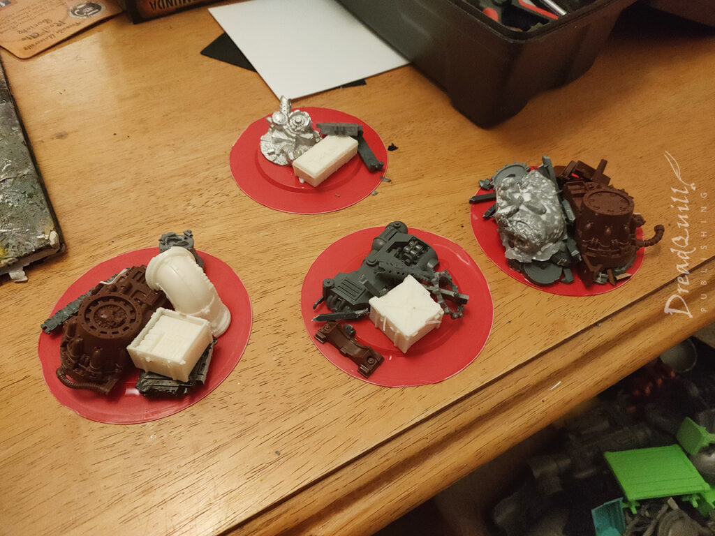
I had rather unhelpfully thrown away all my old CDs from the noughties, which would have been perfect scatter terrain fodder, so I was on the hunt for another half dozen equal-sized round bases that didn’t involve any hacksawing.

I had been planning this campaign over the Christmas season, meaning lots of delicious tubular snacks. Incredibly the lid of my favourite holiday snack (Twiglet tubes) was exactly the dimension I needed! Praise the Omnissiah!

It was only in hindsight I realised I’d overlooked the prospecting site’s requirements to be stood on, and didn’t make them particularly friendly for models to climb on top of.

I got around this issue by a) not worrying about this at all, as players don’t read the rules, and b) allowing gangers to perform their Prospect double action if they were within 1″ of the edge of the site and proving them with heavy cover.

Blocking it out

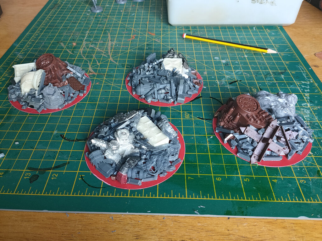
It was particularly satisfying to go through my various bits boxes to pick out pieces I’d been holding on to for some unknowable future project and slap them down to the bases. These would be big, chunky, or heavy pieces that took up space and didn’t have much utility. A hacked up mechanicus generator, miscast crates and pipes, a big chunk of white metal (from Warmachine I think?) and a glob of flash-cured resin.

Sprue Goo

As part of this campaign prep I’d found myself with a glut of sprues. I’ve been more conscious of hobby wastage and I didn’t like the idea of them going to landfill, and at the time GW’s sprue recycling initiative was yet to reach my area.

I’d seen some recommendations for ‘sprue glue’ – cutting up your empty sprues and putting them in a jar of acetate until they become a sticky syrup of melted plastic. It’s used as a kind of liquid greenstuff – smoothing gaps between large plastic pieces or as a more robust filler for scenery. I didn’t fancy the idea of a toxic jar of flammable goo, and I had way more sprues than I could goo.

Instead I got into the habit of hacking my sprues into small straight sections and keeping them in a big plastic tub. I wanted to separate as many of the bits that obviously identify it as sprue – so all round bits were snipped from the straight bits.

This gives me a huge box of scrap filler pieces that look great when sprinkled liberally around junkyard pieces, and really helped to fill out these naked bases.

Filling in the gaps

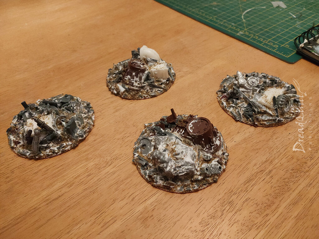
When everything was dried (and extra superglue applied to keep everything attached to the red bases, which turned out to be frustratingly resilient to having things glued to it) I cracked out the tub of polyfilla to complete the look.

I wasn’t concerned that I lost a lot of detail after this stage – theyy were supposed to be mounds of scrap that may or may not have anything useful buried in them. Having a few interesting pieces poking out of a morass of metal and mud seemed like the ideal way to represent the scenario objectives.

A contrasting style

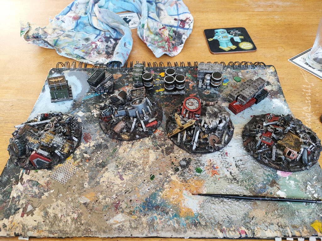
I’m still trying to break out of my micro-scale painting techniques for doing mid-sized scenery pieces like this, and I’d seen a recipe online somewhere for painting scrap using drybrushing and contrast paint. I’m late to the contast party so I didn’t really appreciate what I’d been missing out on.

The recipe was simple: drybrush silver, then contrast, then weather. It couldn’t be that simple, could it?

I undercoated everything black and cracked out the big brushes.

Mining my own business

This was my first proper foray into Contrast Paint, (to me) a new-fangled invention that I didn’t see a place for in my usual paint lineup. It was designed for batch painting armies, so why would I need it?

Boy was I wrong.

I went out and picked up half a dozen contrast colours I thought would work well:

  • Aggaros Dunes
  • Garaghak’s Sewer
  • Skeleton Horde
  • Black Templar
  • Guilliman Flesh
  • Flesh Tearer Red
  • Blood Angels Red

These were then applied liberally and randomly across the scrap piles, directly over a really rough and uneven drybrush. I was astounded at the effect!

When everything was covered in contrast, everything got attacked with Typhus Corrosion to create some matt brown areas and weather the metal a bit more.

I took some silver paint and very roughly highlighted some of the more prominent edges, being very careful not to take my time or be particularly neat about it.

A final light drybrush of Ushabti Bone around the sandy bits helps blend it into the floor a bit more.

A prospective new technique

I’m so blown away with how easy and enjoyable that Contrast technique is, I’ve adapted it for loads of scenery projects coming up. It scales up really well, and Contrast has much better coverage over large areas than the regular washes do.

I’m incredibly satisfied with this whole project – finding exactly the right number of correct-sized bases, freeing up huge chunks of my bits box, creating a huge box of sprue ends, and discovering a completely new painting technique. It couldn’t have gone better!

I’m very excited about the possibilities this opens up. Perhaps entire hills made of scrap to create a junkyard board? Be still my beating heart…

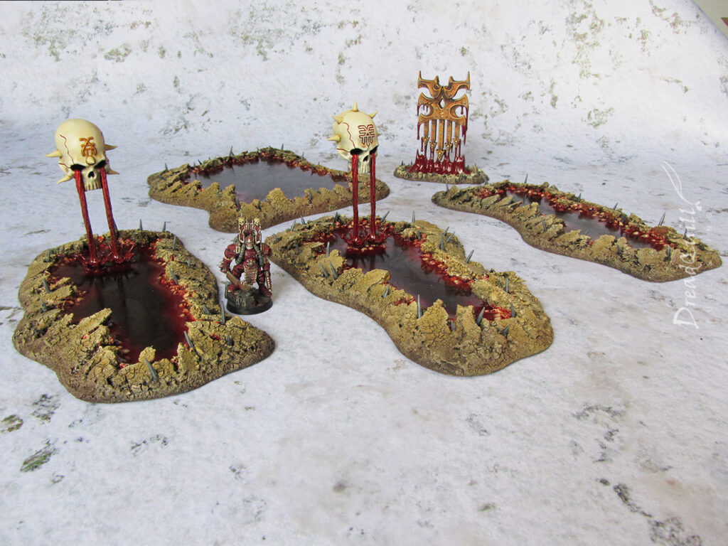
MOTB: Khorne blood pool scenery

Finished product first!

One of my first events I felt safe returning to was an Inquisitor day at Warhammer world, run by venerable members of the Conclave with a familiar format. There are 3-4 time slots during the day, and everyone can have a crack at running a one-off game with a group of people they might otherwise not usually play with.

One of my many lockdown projects was a trio of 54mm Bloodletters, and I was eager to pit them against some worthy opponents. It wasn’t acceptable for them to simply be there though, clearly they needed some set dressing to add to the drama.

I already had a few odd Chaos-y bits, like the classic Warhammer Temple of Skulls kit, but I wanted something more Khorney. Perhaps it was time to delve into the mysterious realm of resin.

Continue reading “MOTB: Khorne blood pool scenery”

Chapter 2: Lost Hope | Inquisitor battle report | Scenario 5

This is the second Chapter mission of the Crown of Bones Inquisitor campaign, where three warbands clash in the lost colony of Fengel’s Hope. All are pursuing leads to the Crown of Bones, some picked up from their investigations on the Ius Soli. One warband has beaten the others to the area and has laid a cunning trap…

This is fifth scenario in the campaign, the others being Annex side missions like last week’s Silent Choir. The stakes are higher in Chapter missions, as it costs a precious Resource to buy in to the scenario. Fail too many Chapter missions, and your warband might lose its place in the finale for control of the Crown of Bones…

Continue reading “Chapter 2: Lost Hope | Inquisitor battle report | Scenario 5”

The Silent Choir | Inquisitor battle report | Scenario 4

This is the fourth instalent of the Crown of Bones Inquisitor campaign, and it’s another annex mission (similar to last week’s Sundown on Skathi) between two new warbands in the campaign lead by rival Inquisitors.

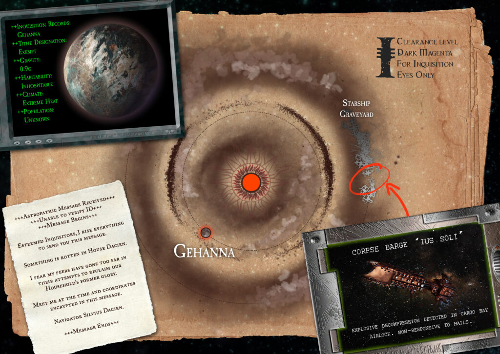
In this scenario, both warbands are looking for the source of the encrypted message that catalysed the Crown of Bones investigation, and they have traced it to an abandoned astropathic spire in the middle of nowhere. They quickly realise the spire isn’t as abandoned as they’d hoped…

Bottom left: the encrypted message in question
Continue reading “The Silent Choir | Inquisitor battle report | Scenario 4”