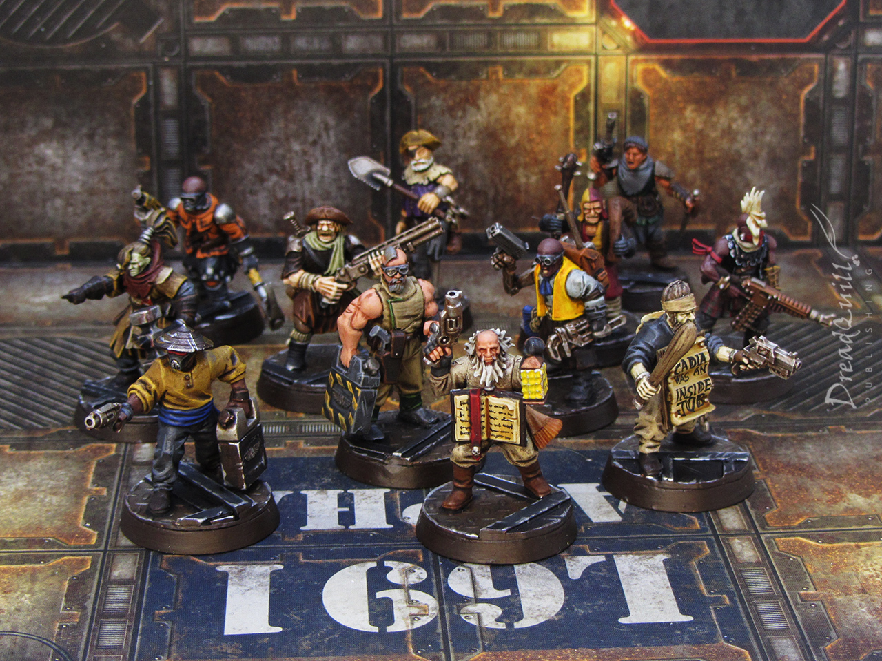
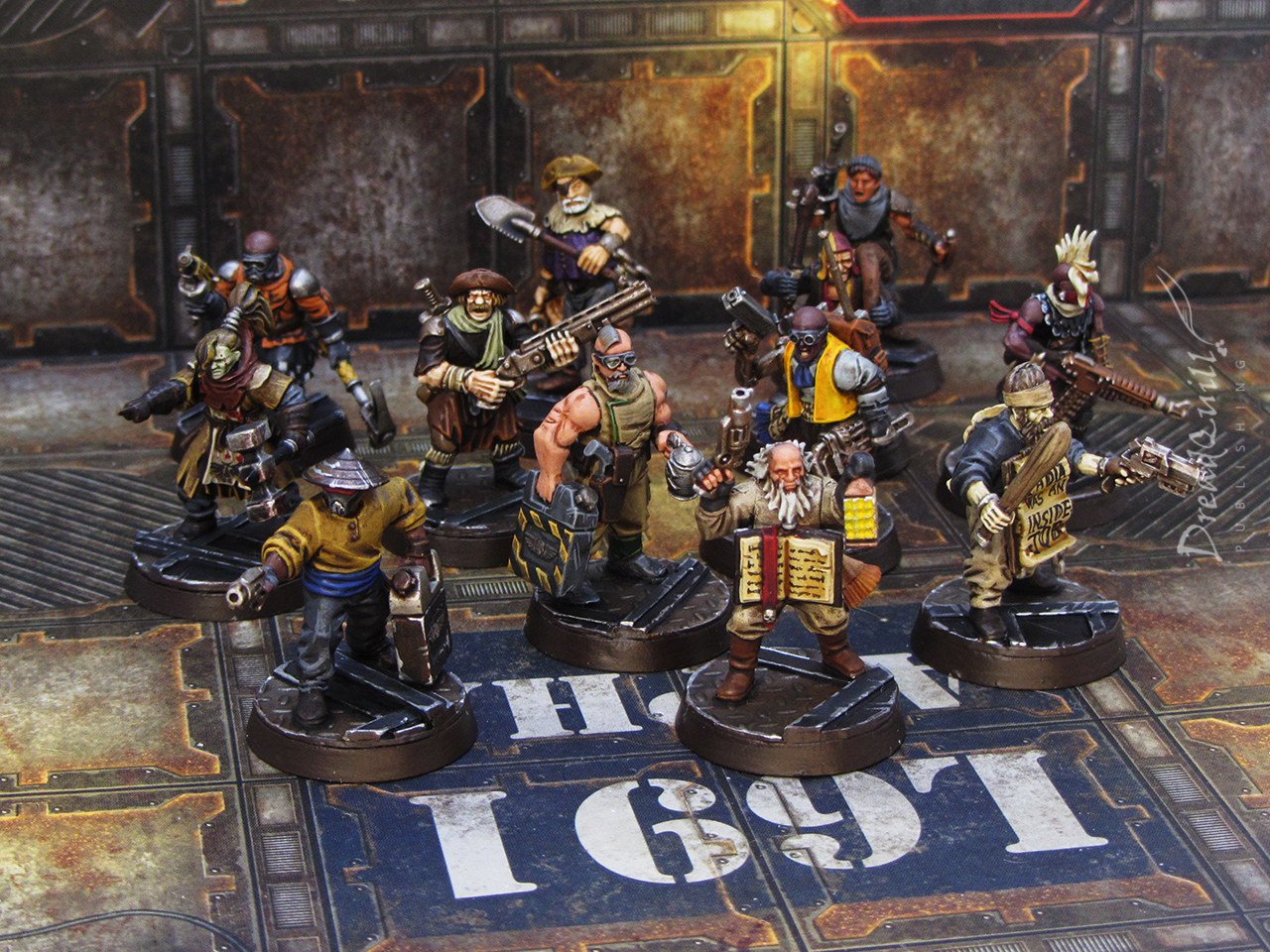
My local FLGS Asgard Wargames is running a competition on its Facebook group to get a new unit painted every week for a month. Motivated by the prospect of material reward, I figured it was also an excuse to clear my grey mountain and splash some colour on miniatures I’d otherwise never get around to painting.
The loose theme I went for was Necromunda, and first on the chopping block was my group of kitbashed “civilians” that I put together a while ago.
Since their creation, they’ve been incredibly versatile for not only being civilians in games of Necromunda, but also as hired guns, NPCS, and stand-ins for RPG characters.
The brief
They needed to be painted up in just over a week, which meant no dilly-dallying and lots of easy techniques, but I also wanted them to be vibrantly coloured. It would be easy to do another Beast House of grey and brown, but I didn’t want any two to look the same.
So, just come up with a dozen different easy-to-paint colour schemes in a week… sure…
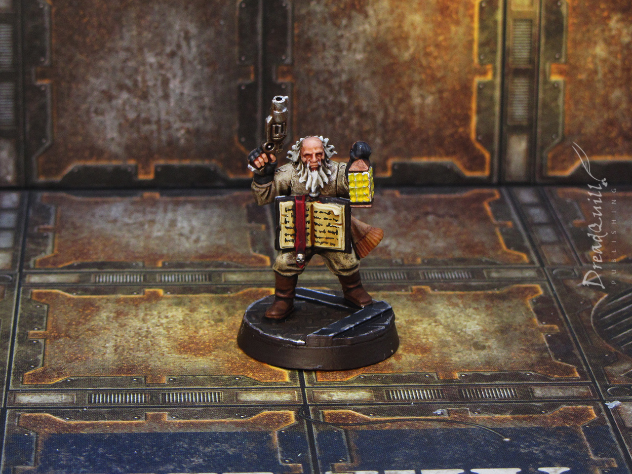
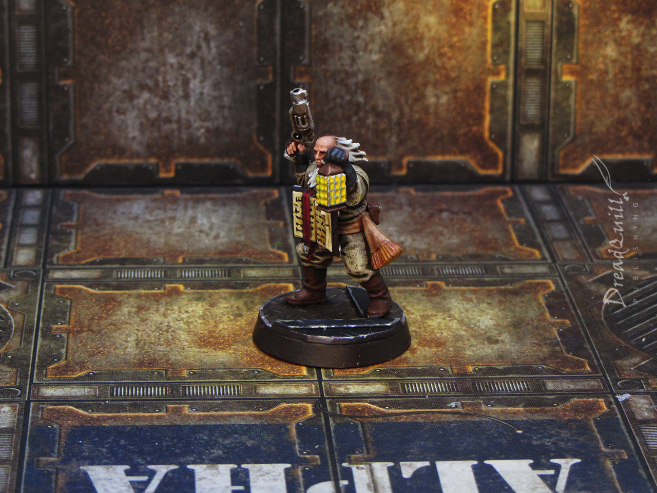
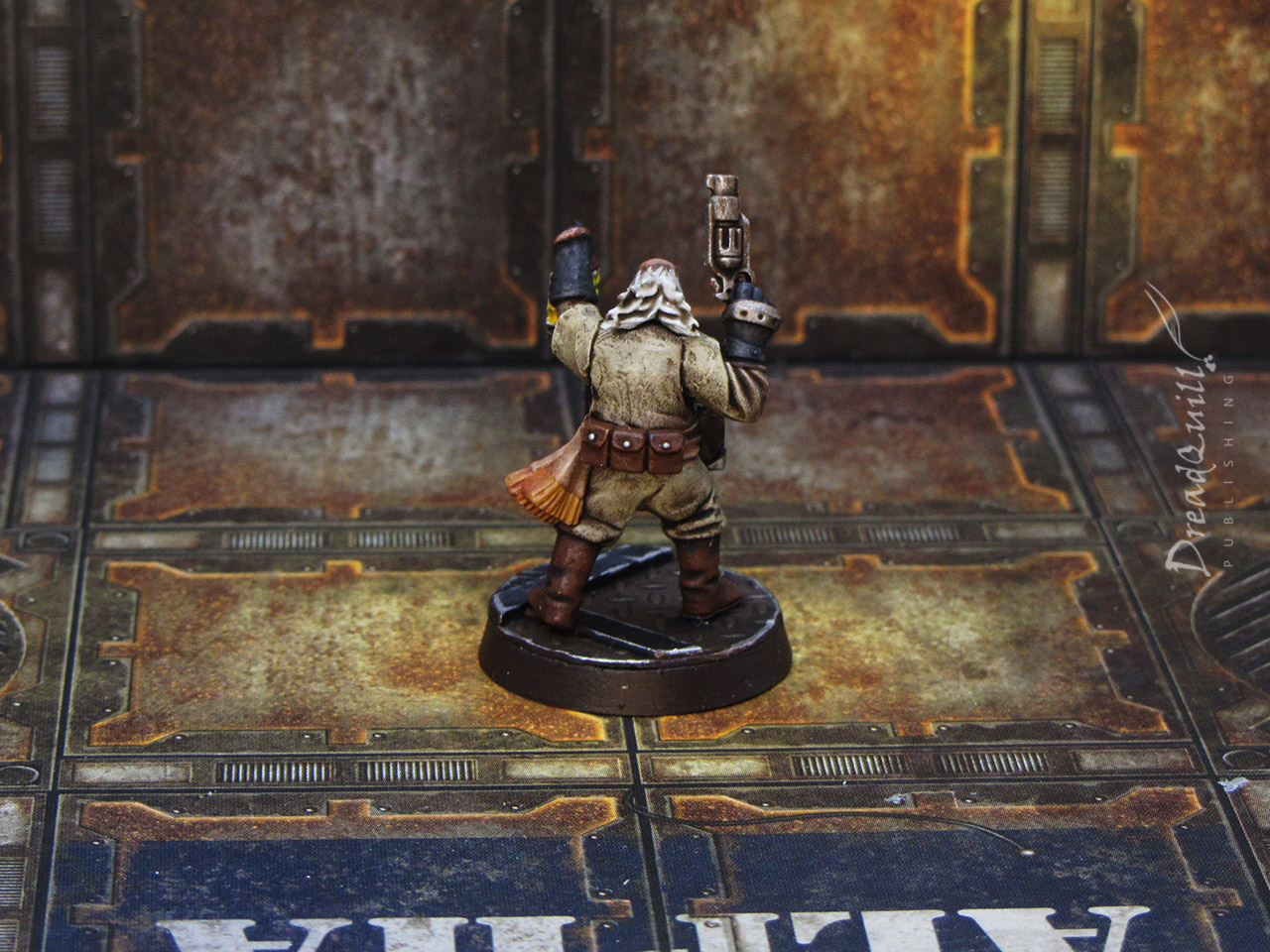
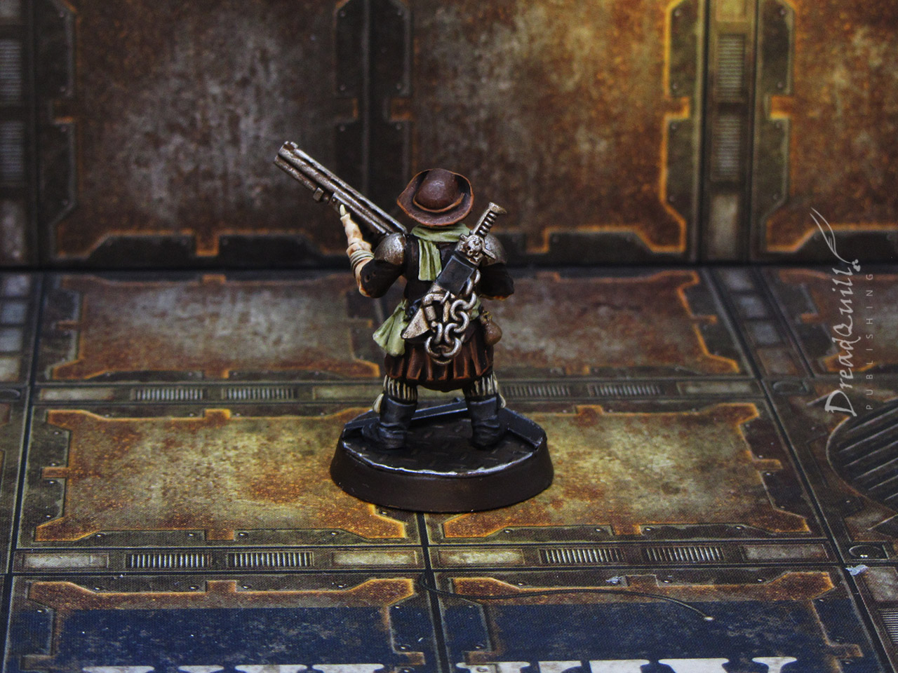
The preacher
First on the table was this religious-looking chap (although the least nutty of the religious bunch) because his character spoke to me the most.
I hate painting yellow, and the thought crossed my mind to attempt some OSL from the lamp but quickly remembered my brief – I coudn’t spend all week on this guy.
His clothes were a technique I’d use on 90% of the rest of the gang – drybrush a colour over the brown undercoat, wash it, then roughly highlight. I went for a Jedi Robes colour scheme to get that itchy hessian sack kinda feel.
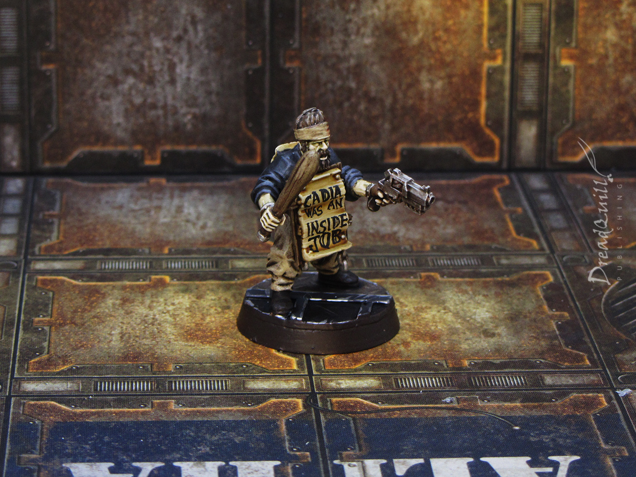
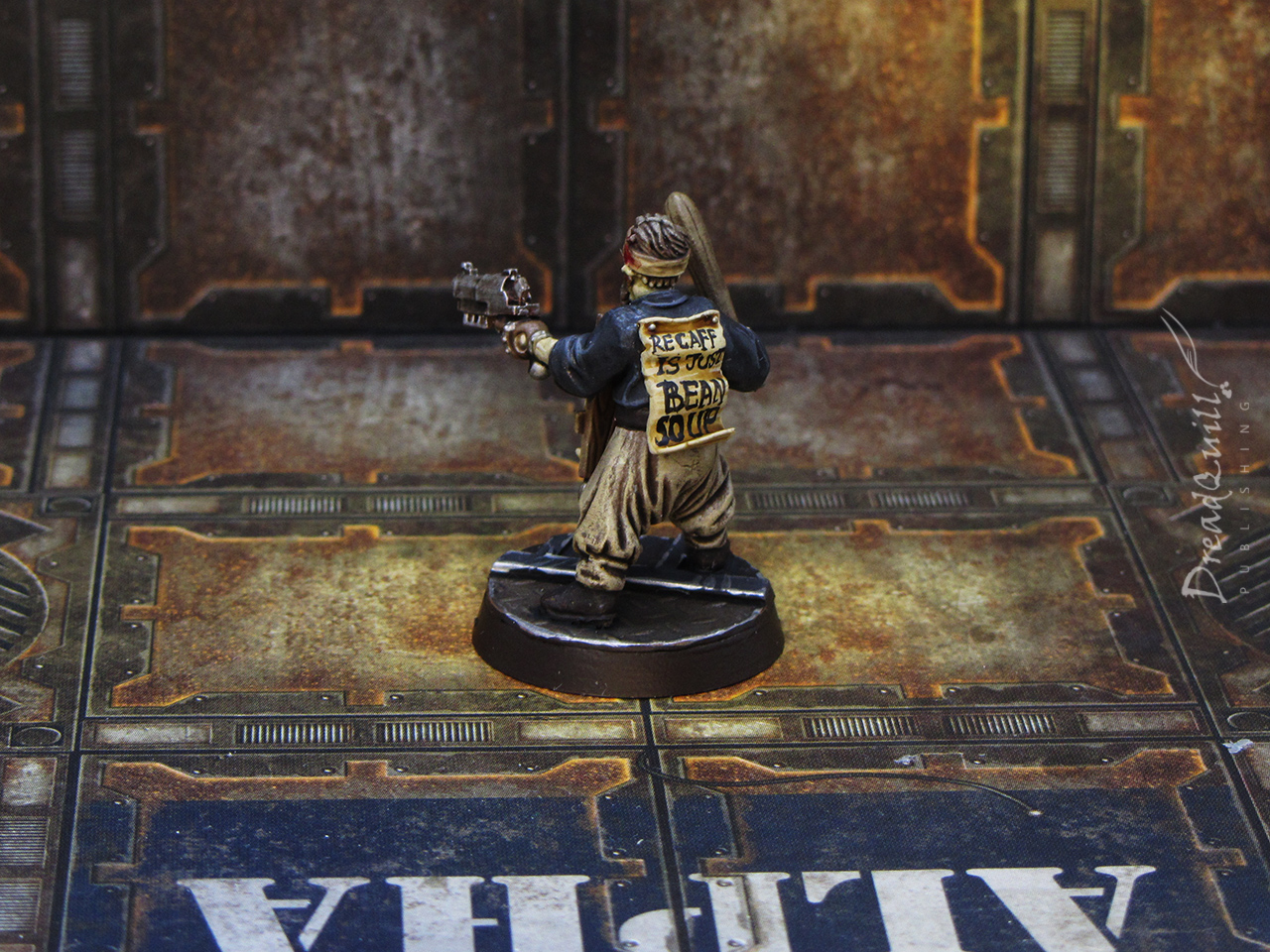
Headwound guy
This guy was popular on the internet when his WIP photo did the rounds. His truths seemed to resonate with people.
Another simple colour scheme, but with a splash of Blood For The Blood God on his headband as a spot colour. The real pull was his crazed sandwhich board message, for which there were too many great options to choose from.
A close third place was “Heresy is stored in the balls – change my mind”, and was rejected solely because it was too long to squeeze onto the tiny sandwhich board.


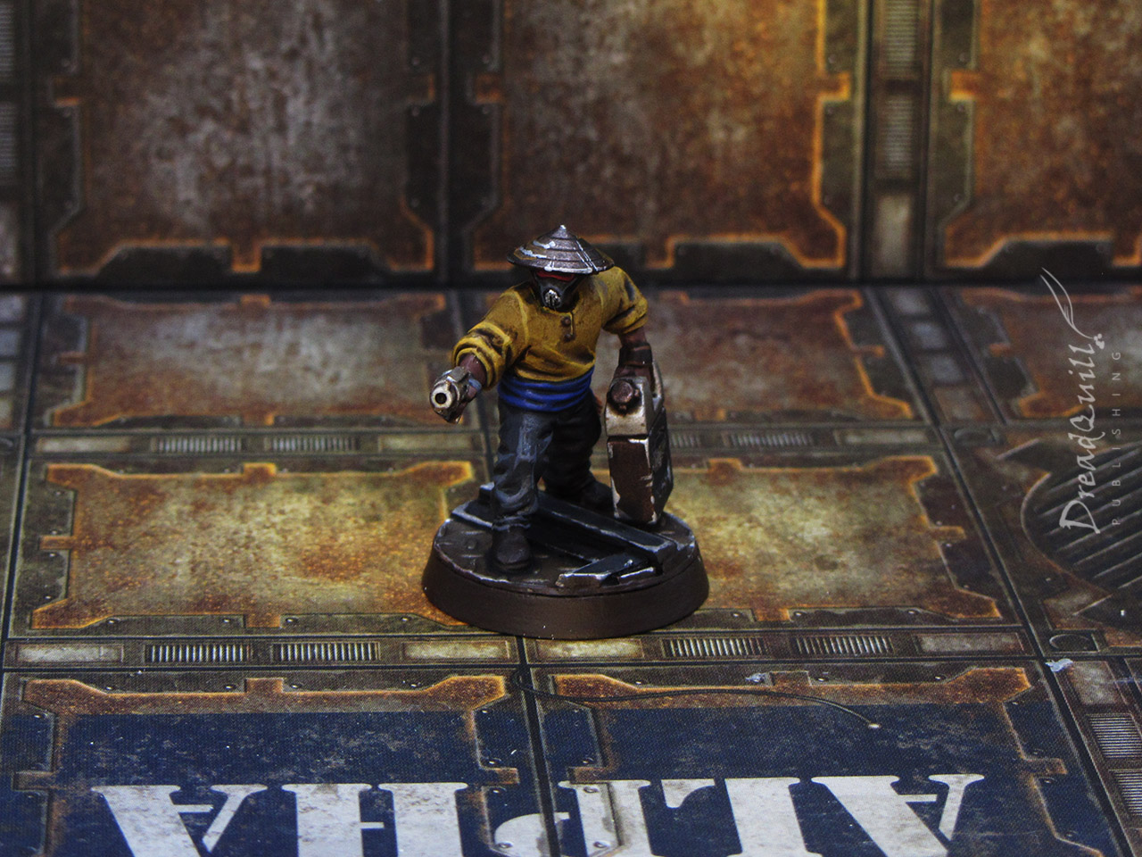
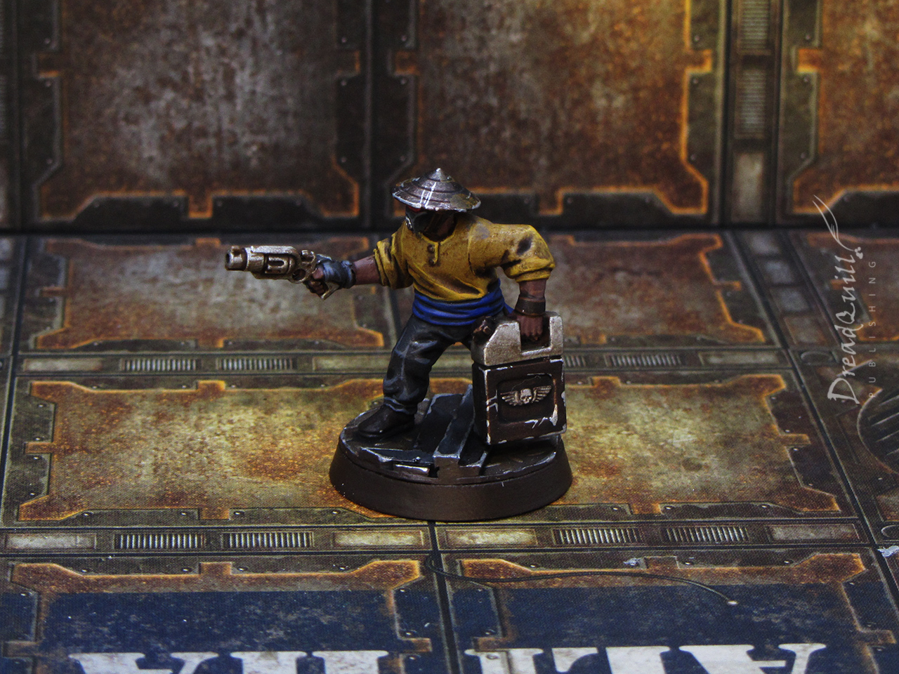
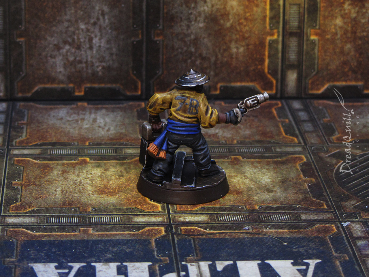
The Water Carrier
I liked making minis that looked like they were out on an errand and got caught short. This one in particular has some nice movement to it, and I tried to tell a bit of a story with the colours.
He’s wearing Orthesian colours and has a faded ‘7-B’ on his back, implying he’s a docker or rating working on a ship somewhere and had just popped out to grab a can of something before it all kicked off.
The off-duty guardsman
As detached as Mercy is from the rest of the universe, it’s fun to sprinkle in some mainstream bits from time to time. News of Cadia’s demise would have reached Mercy eventually, along with numerous refugees, AWOL soldiers or old veterans who find themselves without a home.
This was also my first Cadian I’d ever actually painted(!) and only realised halfway through that I didn’t have the correct colours for the armour. I tried mixing my own but I’m not super happy with how it came out.
I still like the overall mini, I like the little touches like the helmet on his belt and tattoo on his arm, and his attitude of “Oh I guess we’re fighting today huh”.


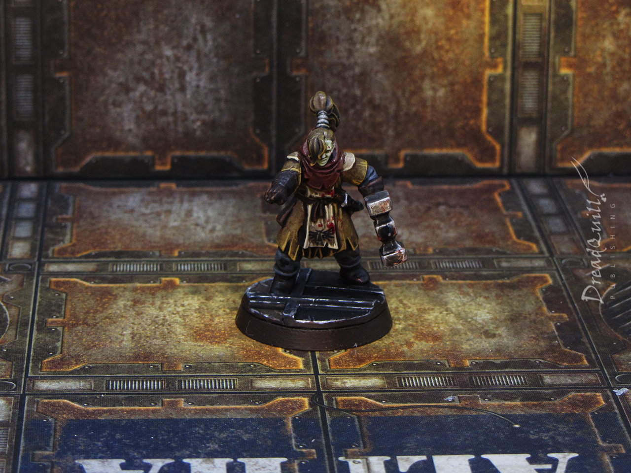
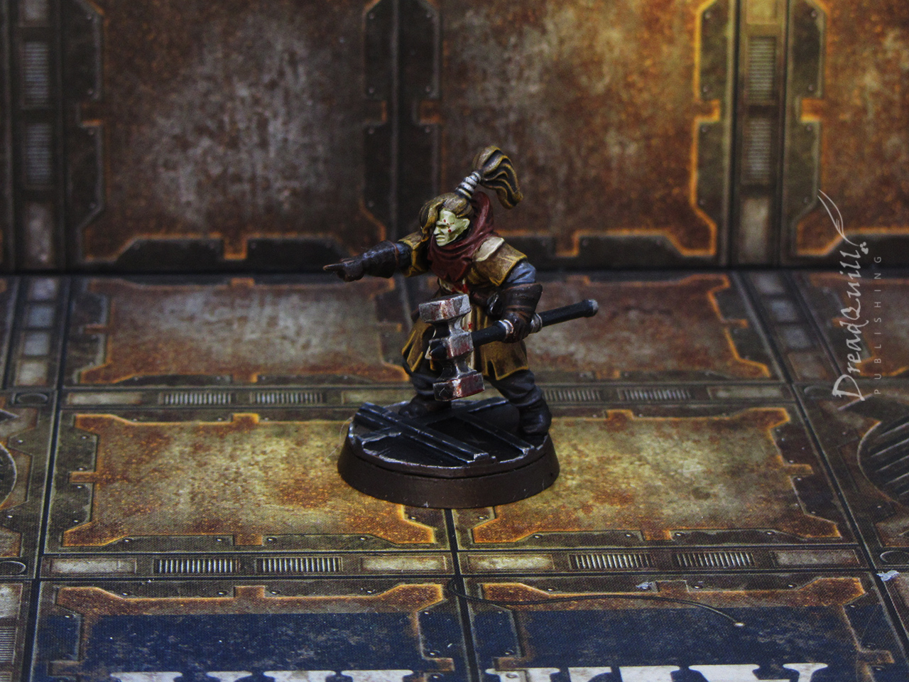
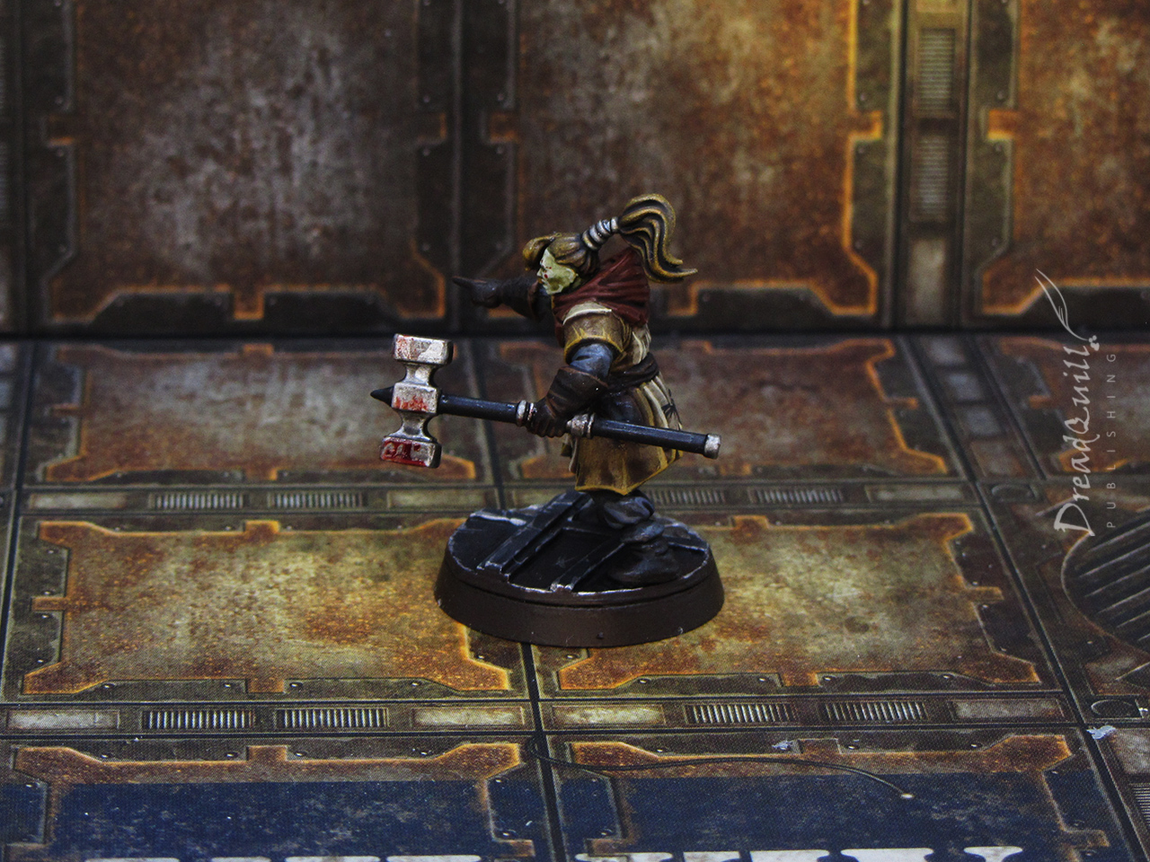
The hammer priest
Although I initially envisioned her as a kind of blacksmith, the idea of making her another member of the cloth was more enticing.
A neatly painted hassock with some rough Aquila freehand was enough to sell the idea of her being a low-ranking priest of some kind, and a touch of blood effect paint on the hammer, robes and face gave her added menace. It changed the body language from “Over there!” to “You’re next!”

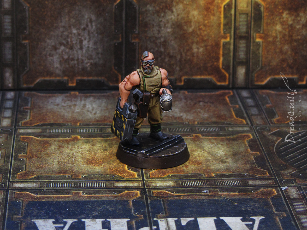
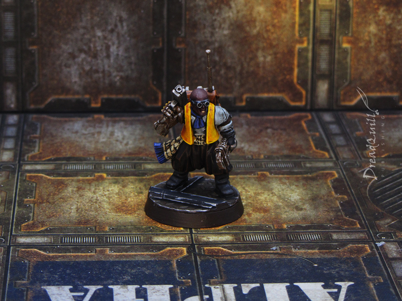
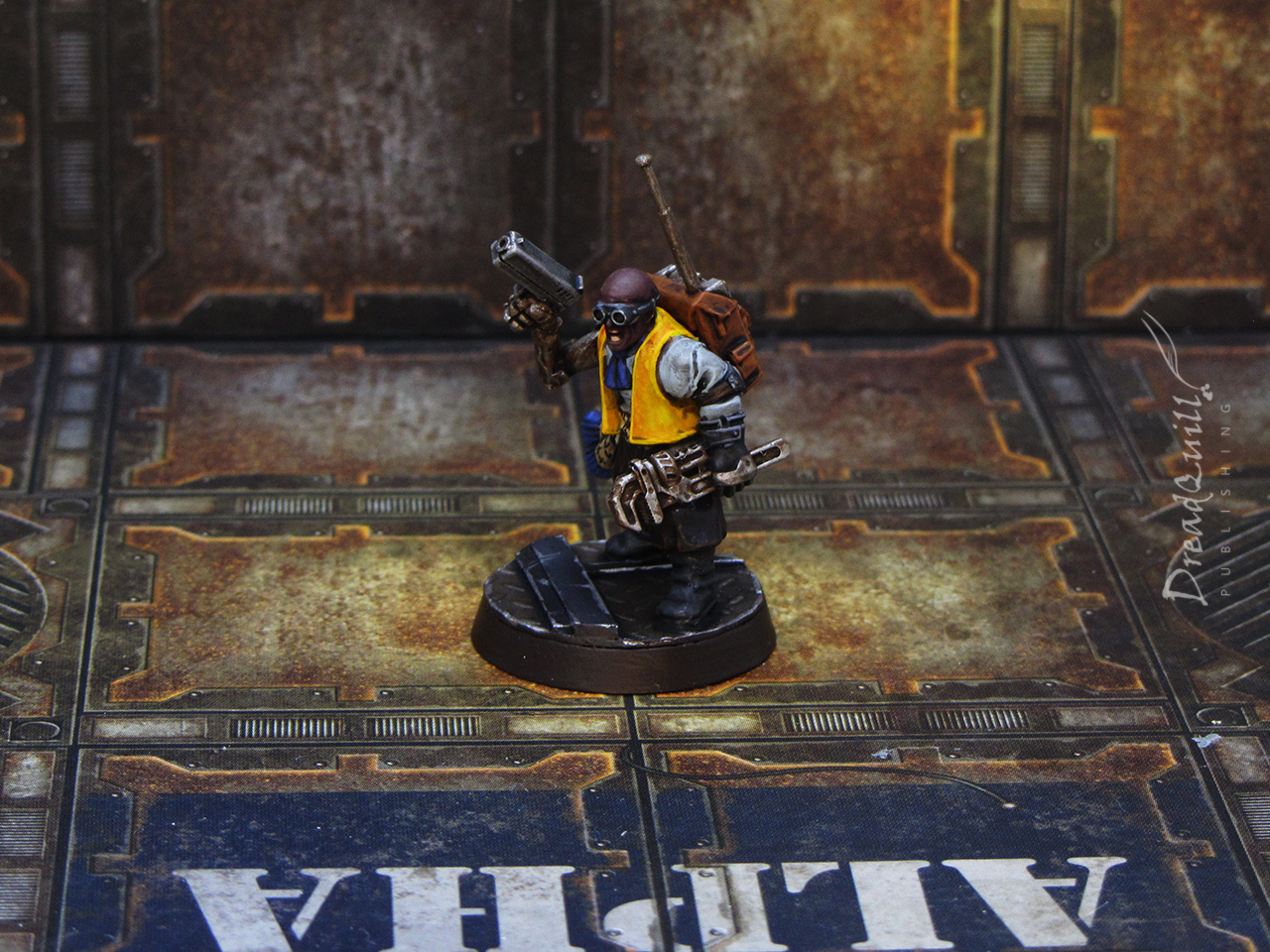
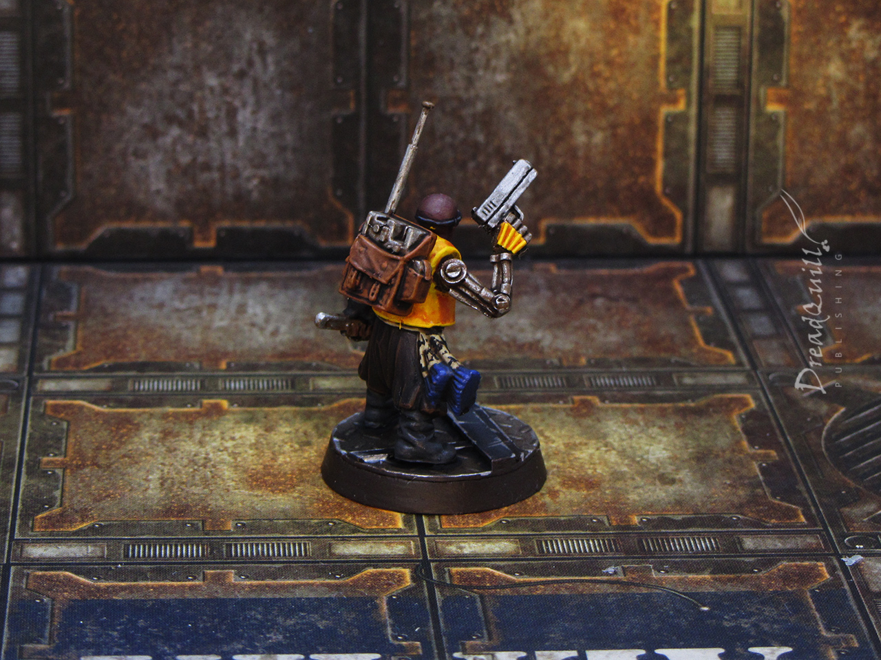
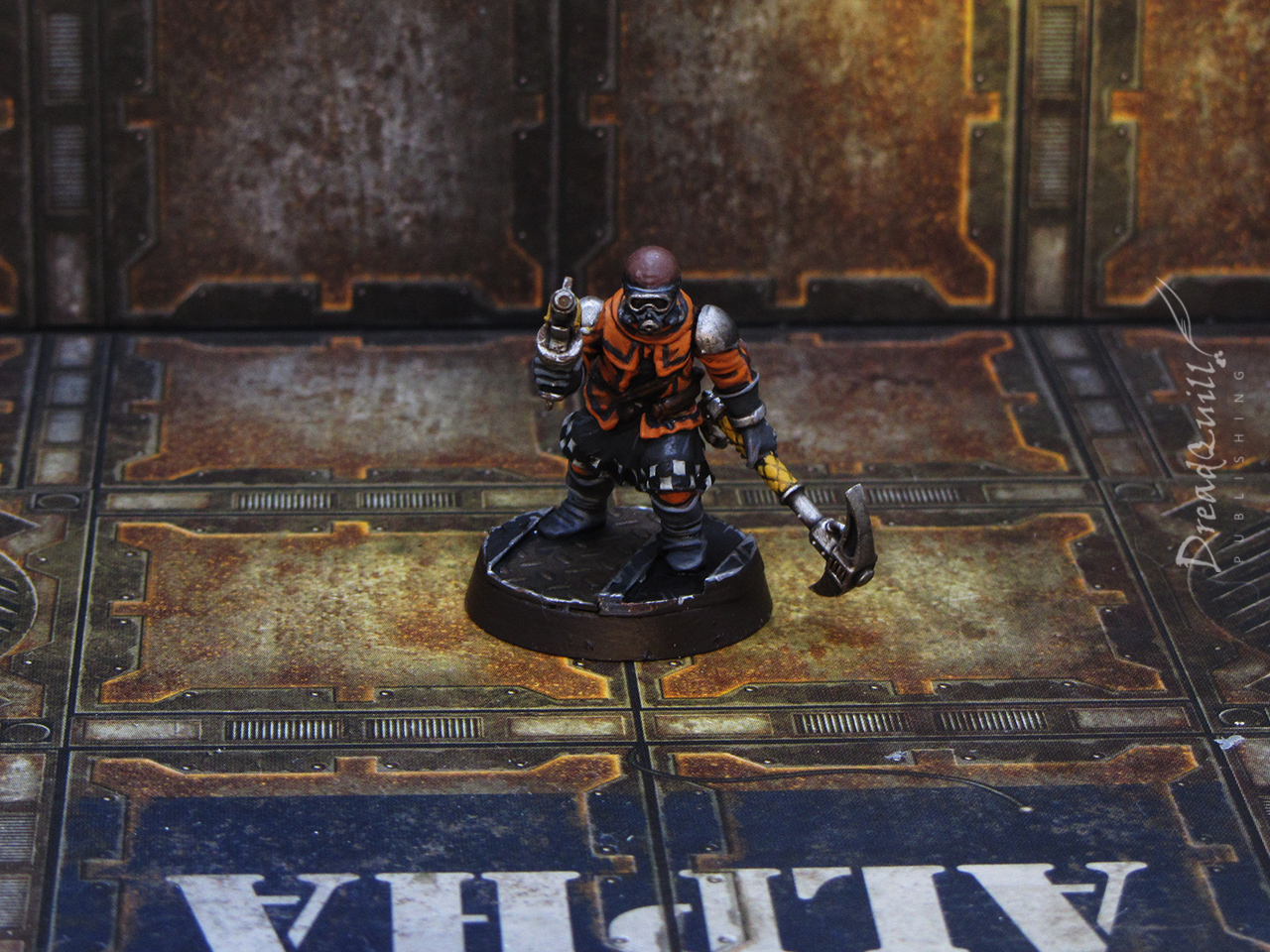
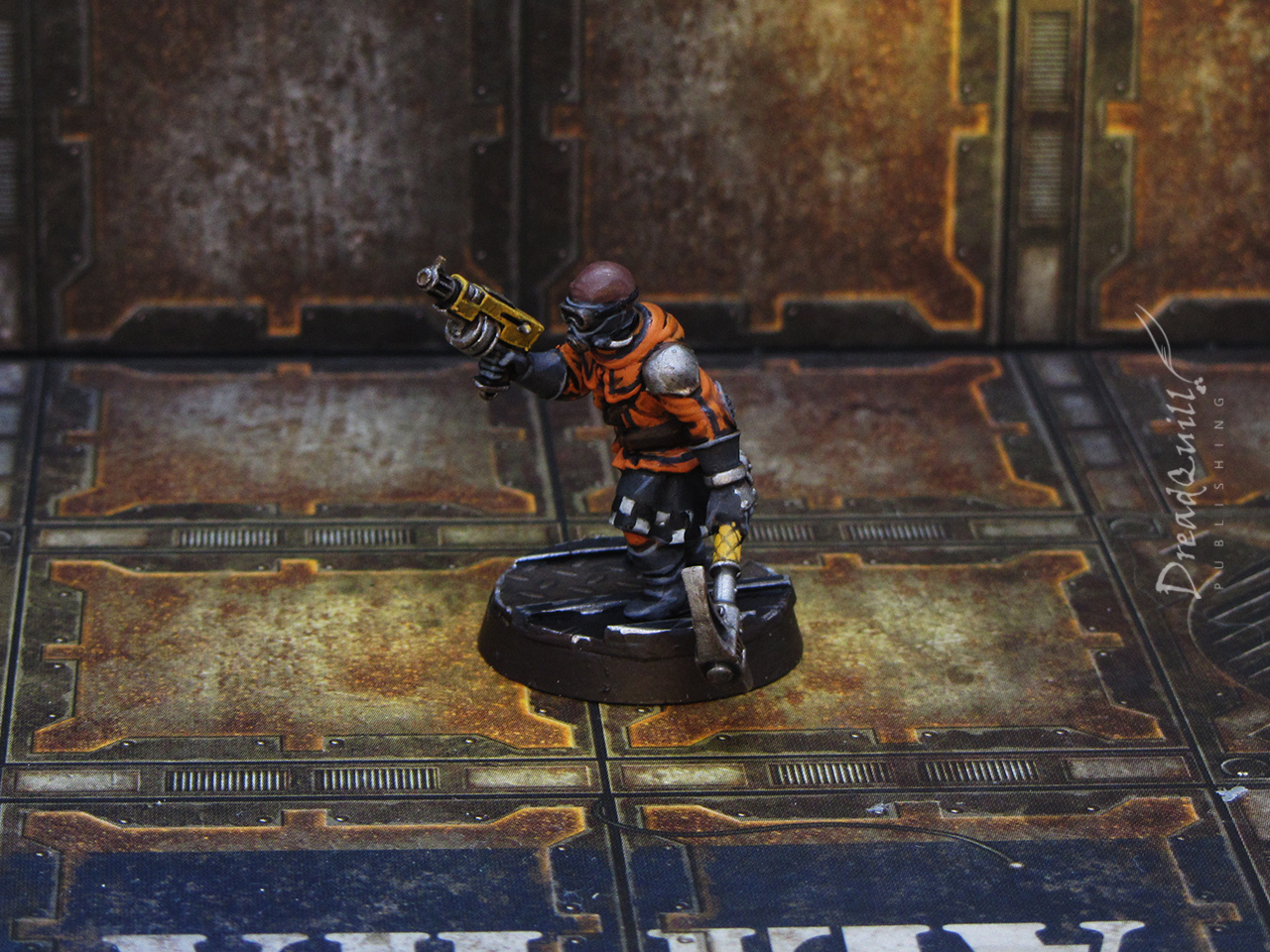
Technical support
I wanted at least one mini in hazmat colours, and this chap’s metal arm and waistcoat was a good opportunity to try out a new recipe for yellow – using an orange wash instead of a brown or black one. I wanted his bionic arm to have the same yellow as his clothes, as though his arm is company-owned.
I tried to turn his waist sash into something like a ticker tape, or somewhere he wrote things down, but it ended up looking like a religious garment.
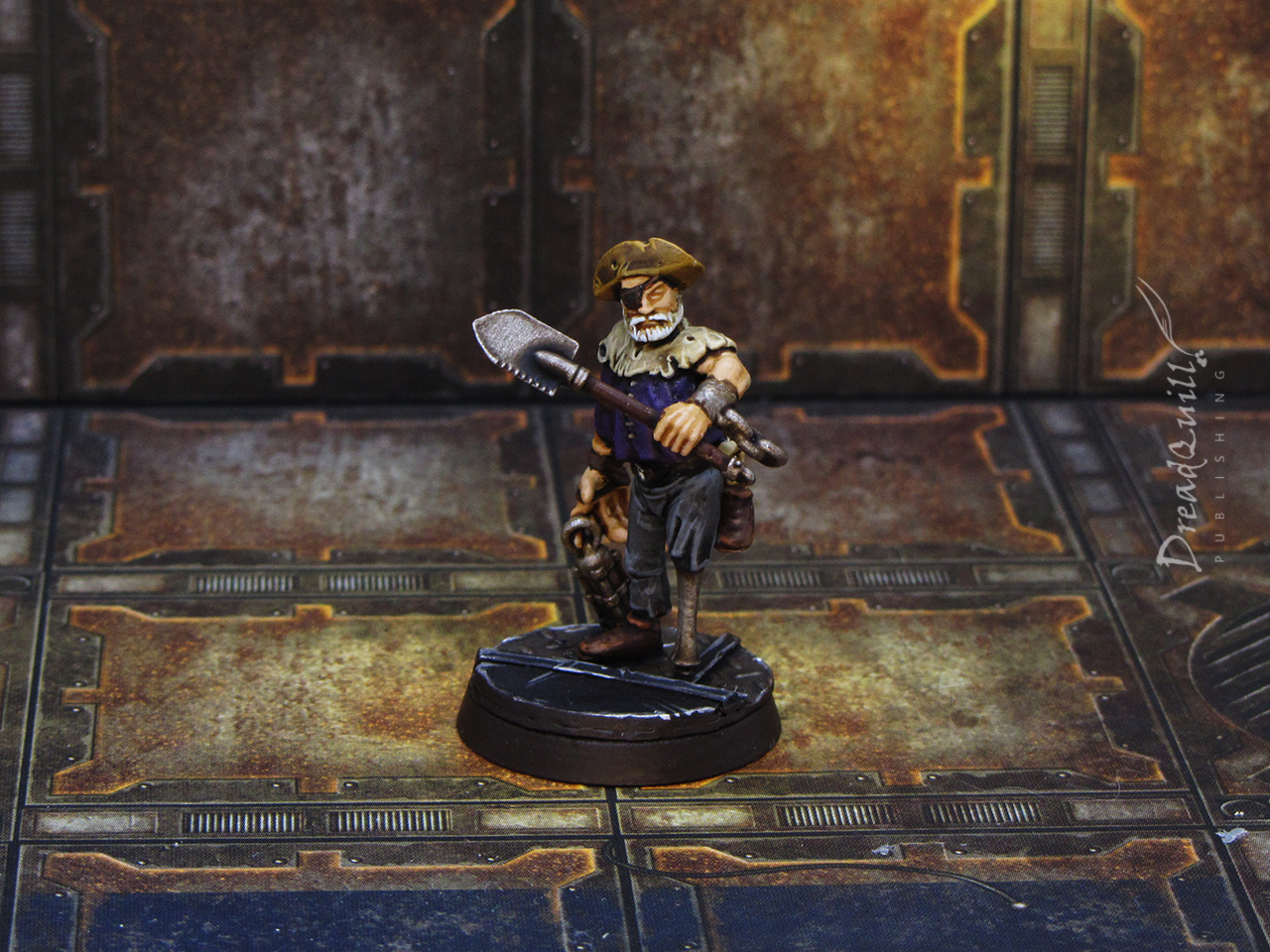
The prospector
You couldn’t have some citizens of a mining space port without some old retired prospectors, and I’m getting real Stinky Pete vibes from this guy. His arms were from the Genestealer Cult Neophytes, so have very mutant vibes to them. I wanted to make them as human-coloured as possible, as making them purple or green would give them a GSC/hidden alien flavour that I didn’t want.
Some of these minis were so fast to do, many of them didn’t even get a highlight stage. I’m following my 2019 mantra of ‘finished, not perfect’, and I think it really works when painting up minis like this!

The miner
I definitely wanted one mini in an orange jump suit, as I really like the aesthetic that many GSC colour schemes have. Unfortunately the minis I used didn’t lend themselves to jump suits, they are all leathers, pelts, tunics etc, so I had to improvise.
Double-unfortunately I didn’t have all the orange paints I wanted either, so I had to make do with a drab foundation orange. It gets the message across, but it wasn’t the vibrant jumpsuit colour I was looking for. I painted a few lines on to try and make it look more like a uniform, but I don’t think it worked very well. It’s a good proof of concept for future miner endeavours.

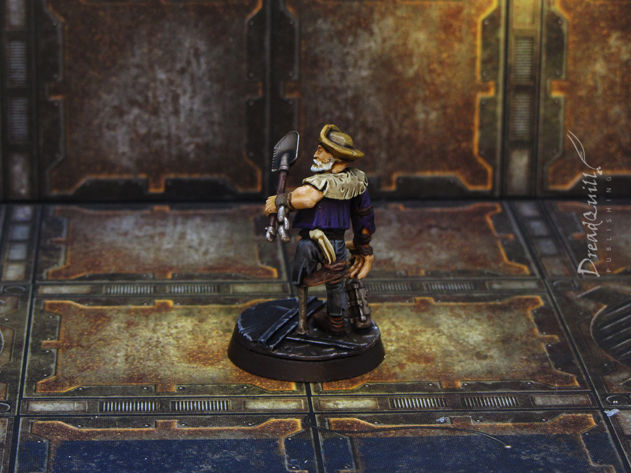
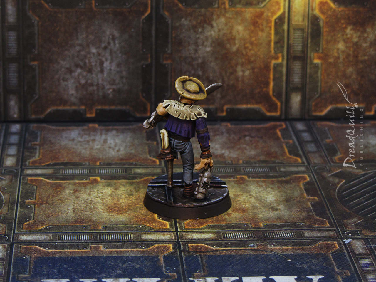
The old captain
One of my favourite of the bunch – he’s got a lot of character and I wanted to give him a mysterious past too. Painting his tattered clothes in noble, luxurious colours implies he’s come from wealth and privilege, so how did he get here?
Lots of opportunities to use him as a fallen Noble or old Captain, missing plenty of bits of himself but could still take your head off with that spade if you pushed in line at the bar.

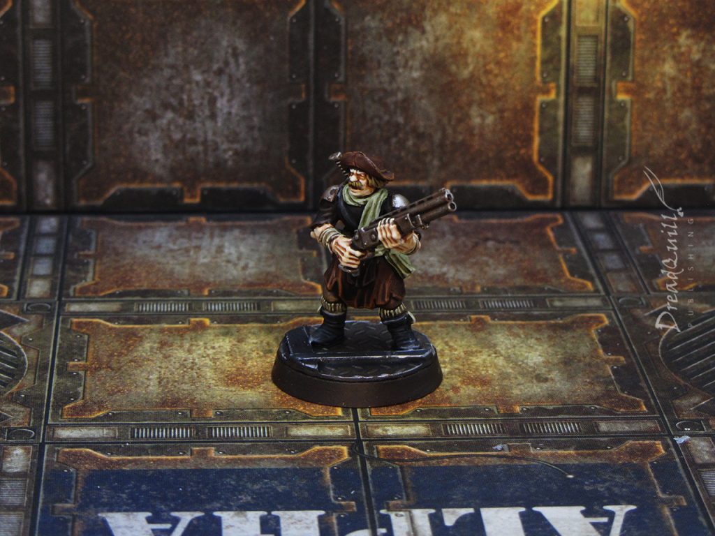
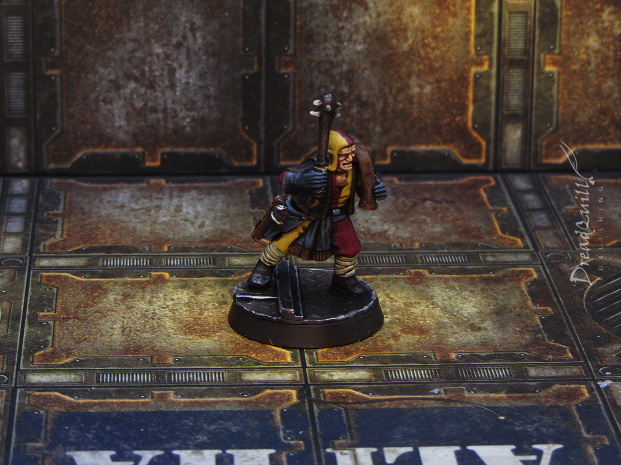
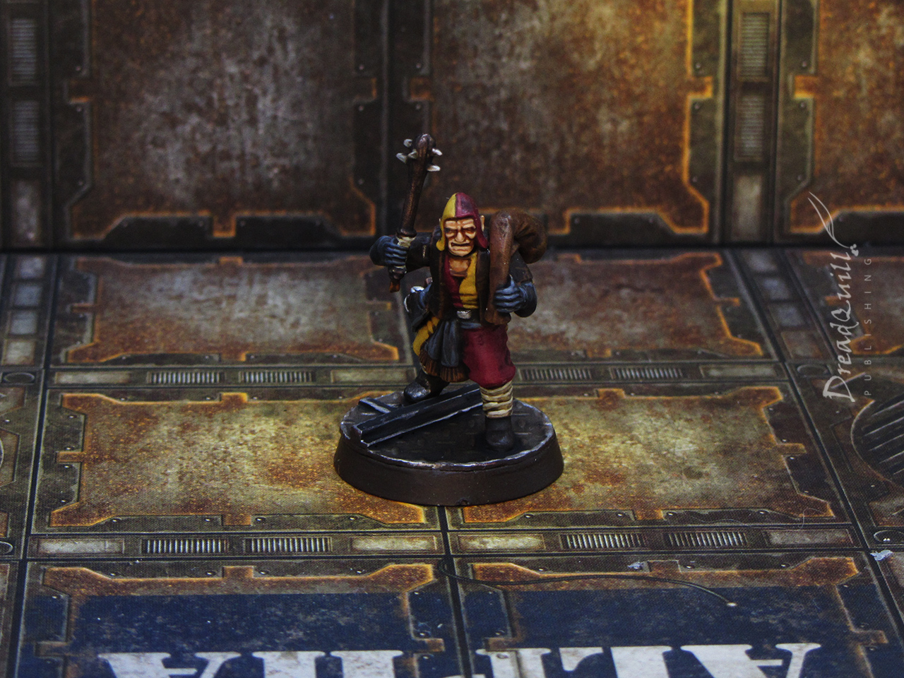
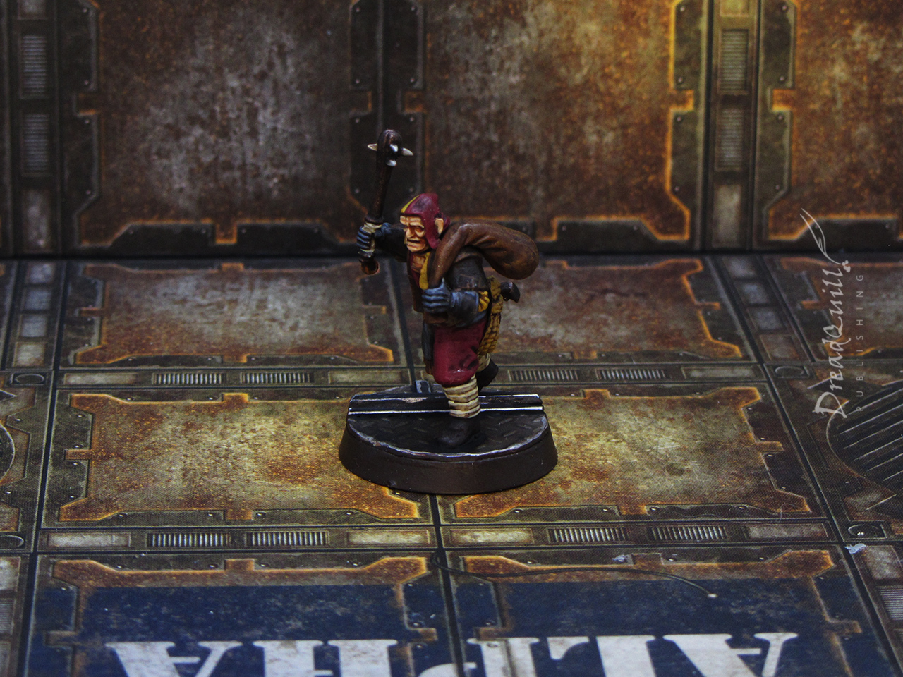
The pressganger
This was a simple guy with a club and a sack, perhaps he’s out clubbing vermin for dinner or something, you can’t judge him. His only tell is a pistol on his hip, which implies he’s in a dangerous line of work. Perhaps he’s a pressganger?
As I was splashing some basic colours on him, my mind wandered to a hitherto unmentioned project involving circus clowns, and I couldn’t shake the image of having him in classic circus attire.
A quick red and yellow quartered pattern and he looked much more interesting. Why is he dressed like that? Is he moonlighting as a pressganger? Perhaps it’s a guild of pressgangers that have adopted a strange uniform? So many narrative threads from a simple change in colour scheme.
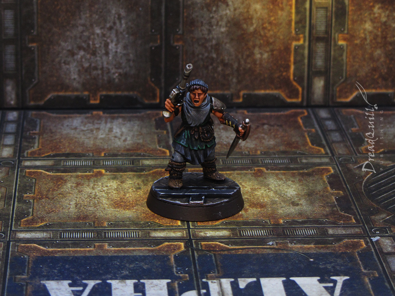
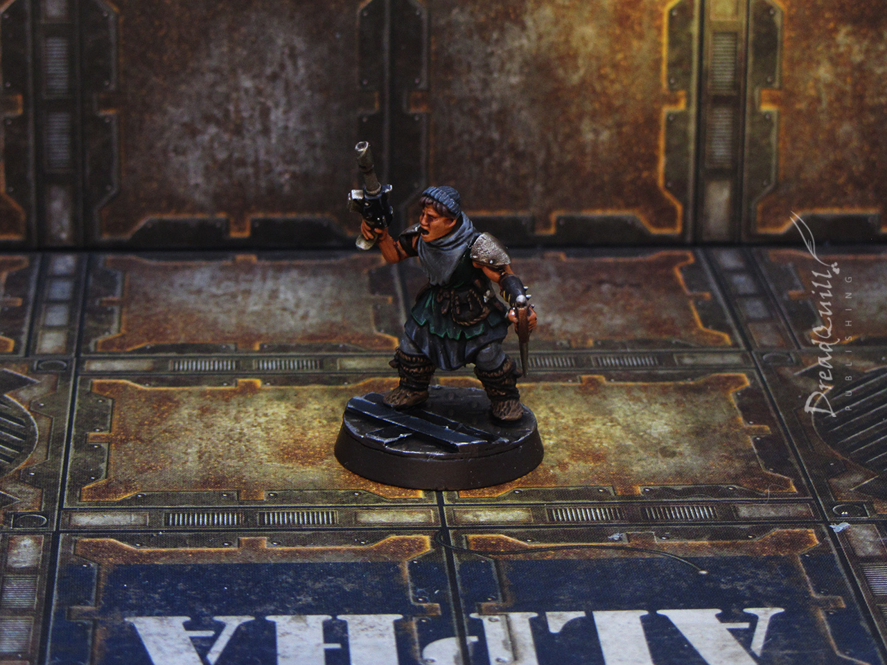
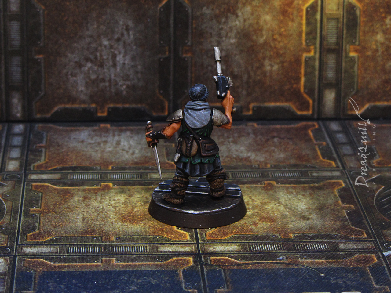
The youth
The closest to a ‘normal’ citizen I made, this one had an air of youthful energy around them – they bring a gun and a knife on their errand runs.
It was probably the simplest colour scheme too, and I was in danger of falling down a classic grey-and-brown hole with my colour palette, so I threw a dark green in there to visually distinguish them from the rest of the citizens.
I assumed the head had some kind of headband or braid running around the crown, but when I was painting it I realised it was a kind of beanie hat. This gave them a pleasing old fisherman vibe which helped tie them to the theme of ports and docks.
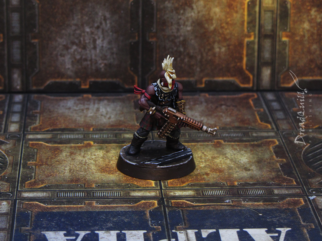
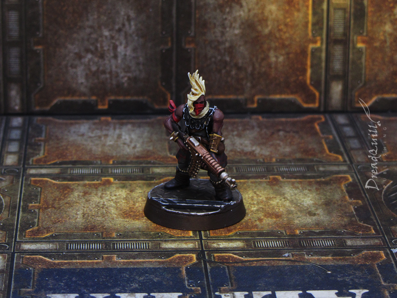
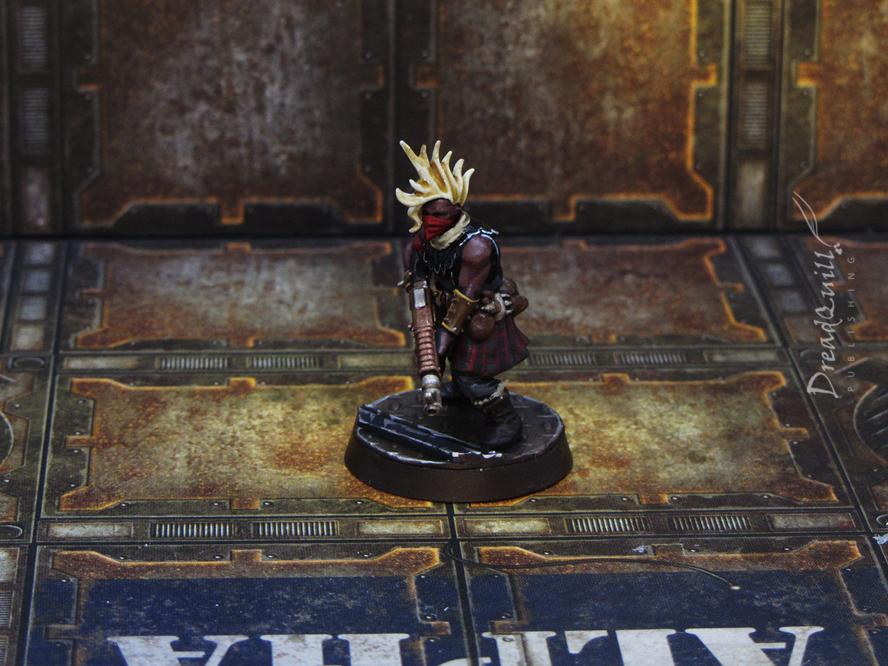
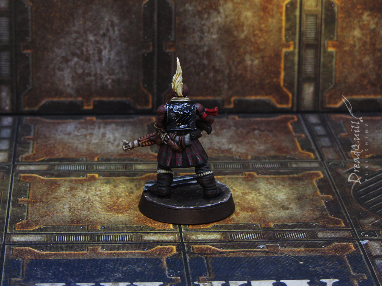
The troublemaker
I like painting red, what can I say.
I wanted to do a kilt pattern on a miniature, this semed to be the best bet. I used my own family’s tartan as a pattern, which got a bit lost under the wash. A matching red face covering and arm band gave her strong anarchist vibes, so naturally she needed the black leather jacket to match.
Bright hair really set off the look, and I think she is one of the more striking miniatures in the bunch.
The gang’s all here
Overall I’m very happy with how they came out. Without an arbitrary deadline I don’t think I’d ever have gotten round to painting them, and for them to have come out so well in such a short time gives me a warm fuzzy feeling inside.
With my rough goal for this year to complete more projects than I start, I think I’m off on the right steps.